Bible editions
Browse by edition, translation, or design. Start anywhere.
How will you use it?
Reading, notetaking, large print, or binder-ready printing.
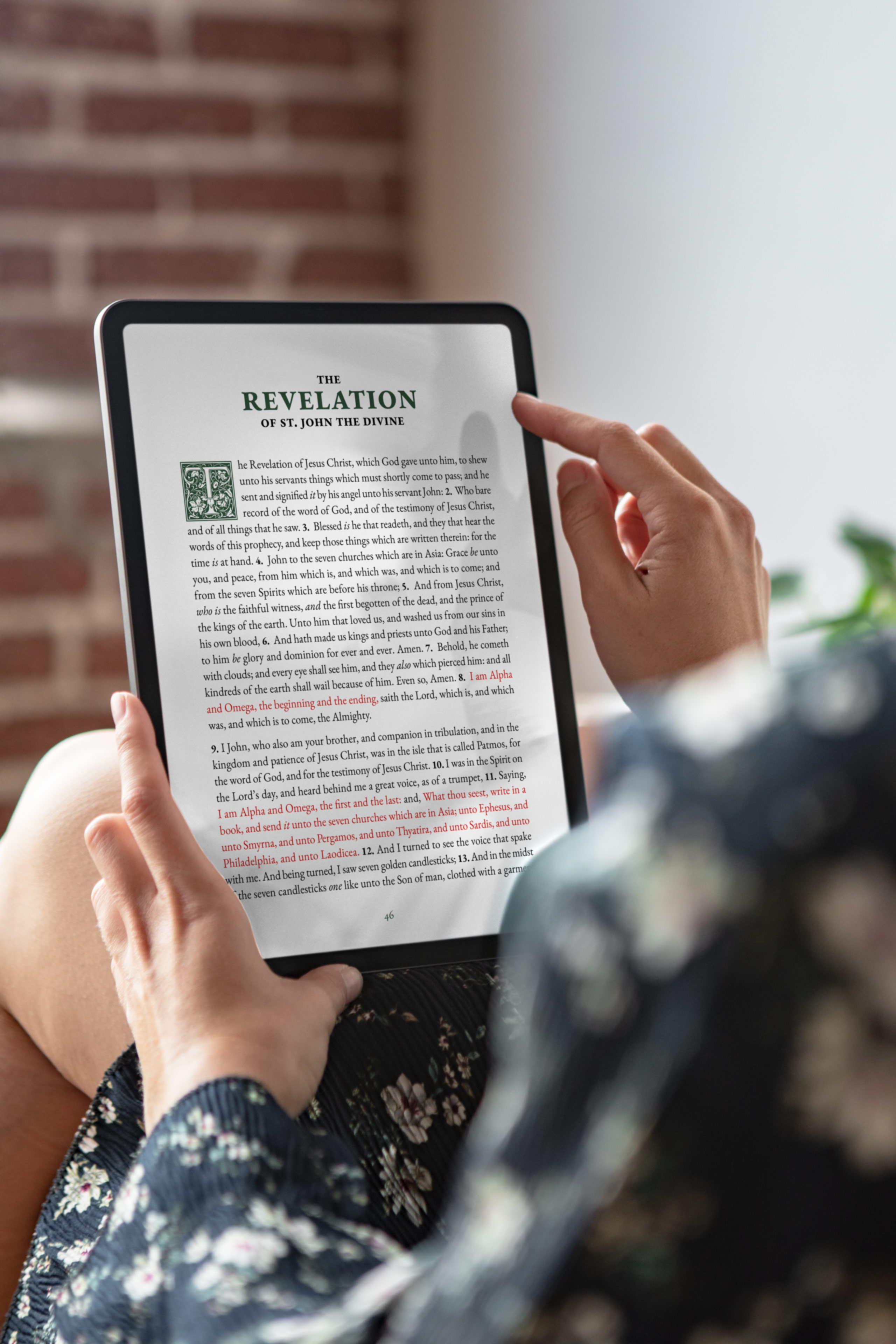
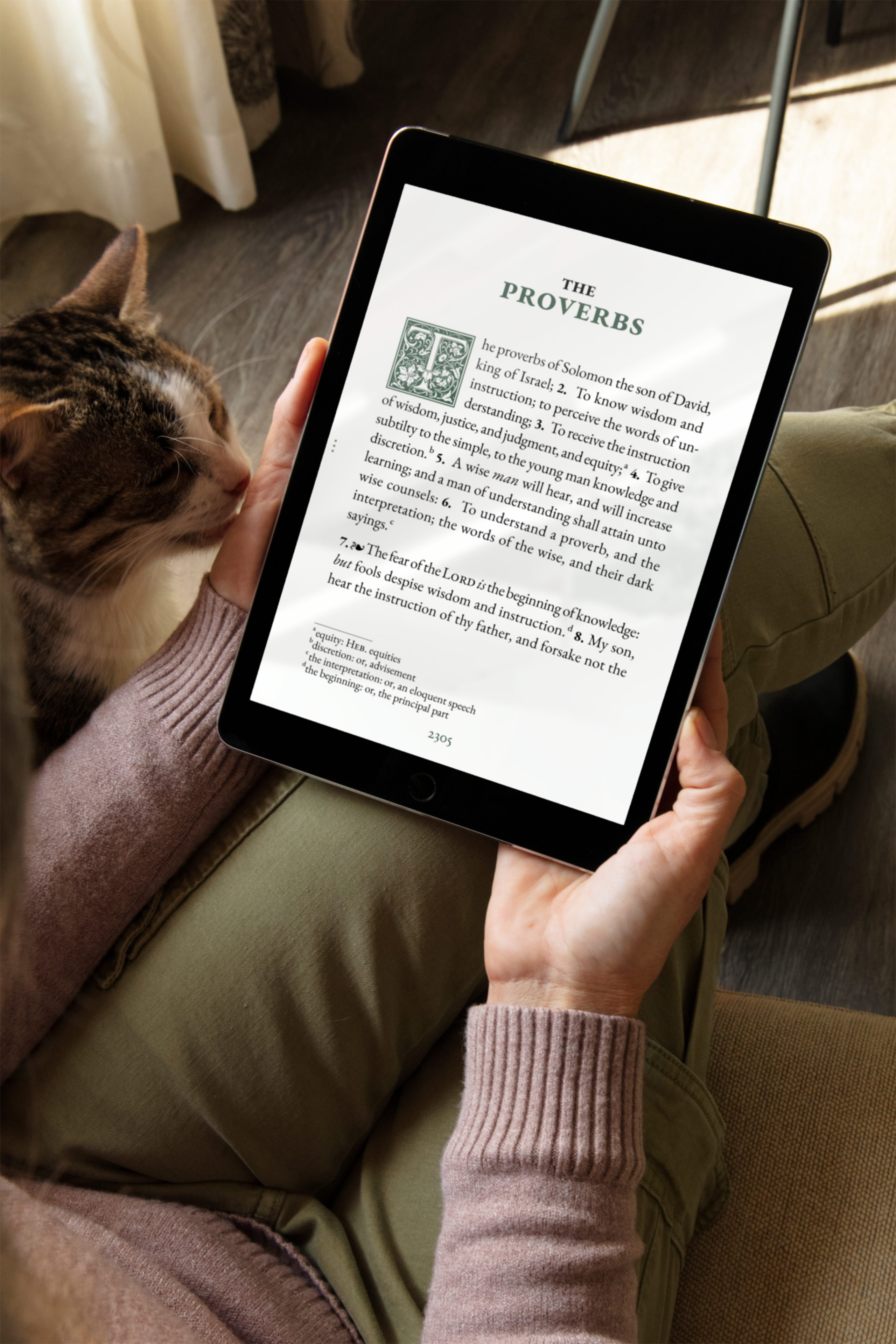
Journal Edition
Regular layout for focused reading. Journaling templates and reading plans in back. Phone and tablet.
- Formats: Phone and tablet
- Layouts: Portrait
- For: Reading and journaling
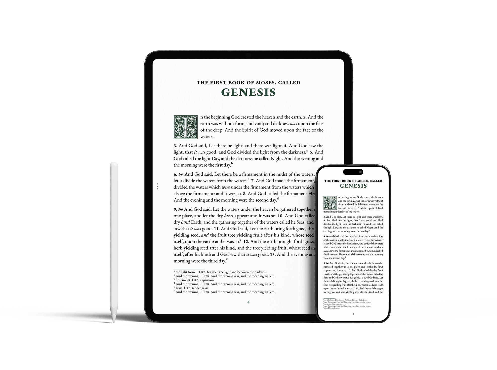
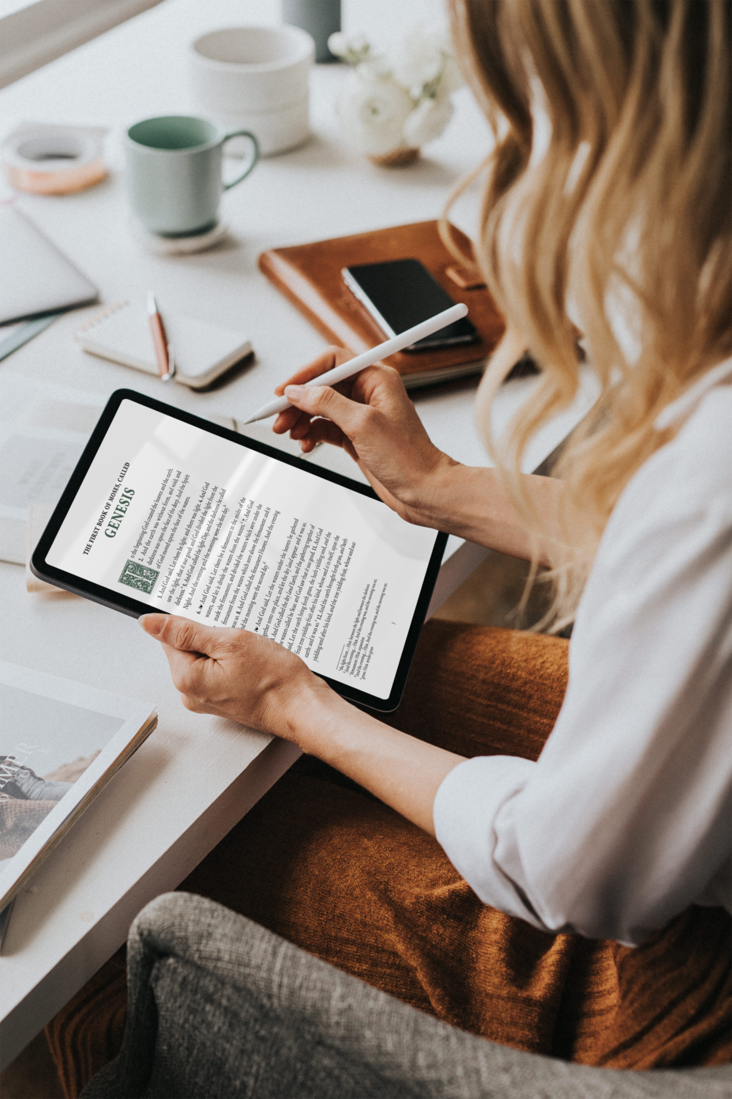
Notetaking Edition
Wide margins on every page, sized for your stylus. Portrait and landscape layouts, for every tablet aspect.
- Formats: Tablet
- Layouts: Portrait and landscape
- For: Taking notes directly on the page
Large Print Bundle
16pt type with wide margins for notes. Includes the Journal Edition. Phone and tablet.
- Formats: Phone and tablet
- Layouts: Portrait
- For: Comfortable reading and notetaking
Print-at-Home Edition
Binder-ready Bible PDFs in A4 and US Letter. Four layouts in one bundle.
- For: Binder and loose-leaf study
- Formats: A4 and US Letter
- Layouts: Reading, double-spaced, notetaking, large-print
Which translation?
Each one is typeset with the same care. Start with the one that speaks to you.
Read the full Translation GuideHighlighted translations available from us
King James Version
Traditional English. Majestic, familiar language beloved for centuries.
- Known for: Timeless beauty
- Best for: Devotional reading
- Books: 66
Berean Standard Bible
Clear, modern English that reads naturally, true to the original texts.
- Known for: Clarity
- Best for: Modern readers
- Books: 66
World English Bible
Accessible everyday English for comfortable daily reading.
- Known for: Accessibility
- Best for: New readers, casual reading
- Books: 81 · includes Apocrypha
American Standard Version
Literal, word-for-word precision for deep study and cross-referencing.
- Known for: Precision
- Best for: Study, cross-referencing
- Books: 66
King James Version 1611
The original 1611 text with Apocrypha for historical study.
- Known for: Historical richness
- Best for: Historical study
- Books: 80 · includes Apocrypha
Pick a design
2 typographic styles, same careful craft. See what you like.
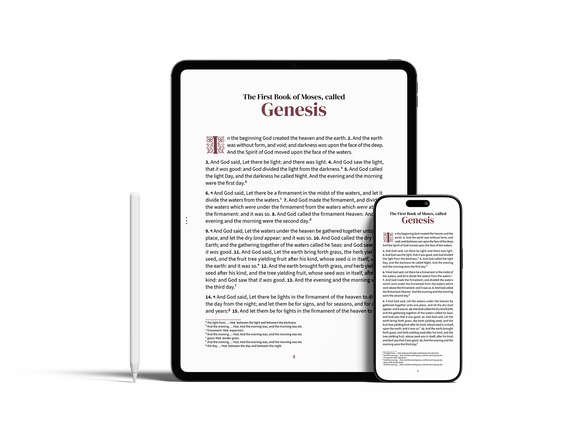
Embrace
Sans-serif body text paired with serif headings. Soft colors, floral drop caps, and generous spacing that gives each page room to breathe.
- Best for: Readers who want inviting, approachable pages they can settle into.
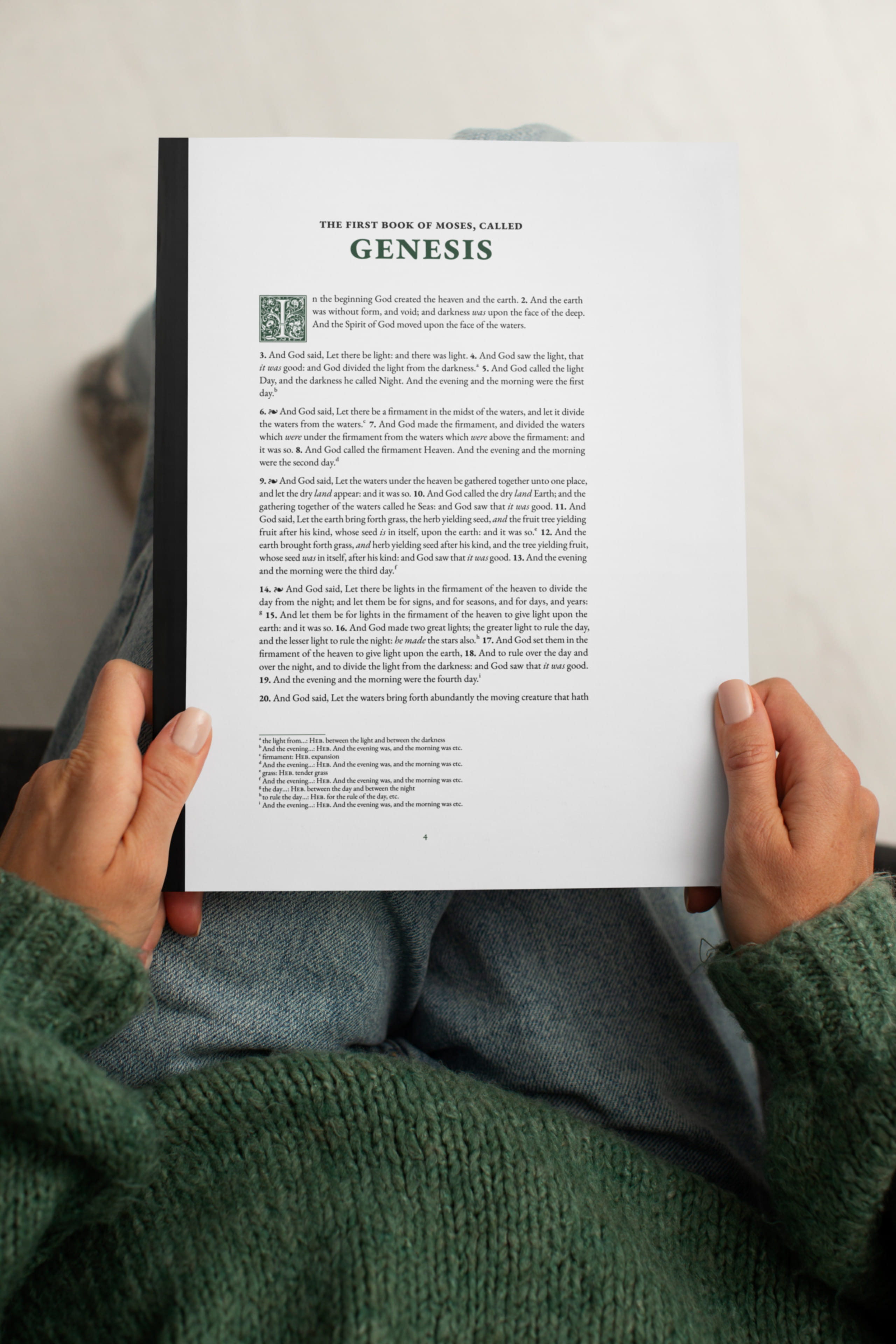
Classic
A serif typeface with the proportions and rhythm of hand-set text. Layouts that follow the conventions of printed Bibles.
- Best for: Readers who value heritage typography and a book-like reading experience.