The Classic design
Rooted in print tradition
A serif typeface with the proportions and rhythm of hand-set text. Layouts that follow the conventions of printed Bibles.
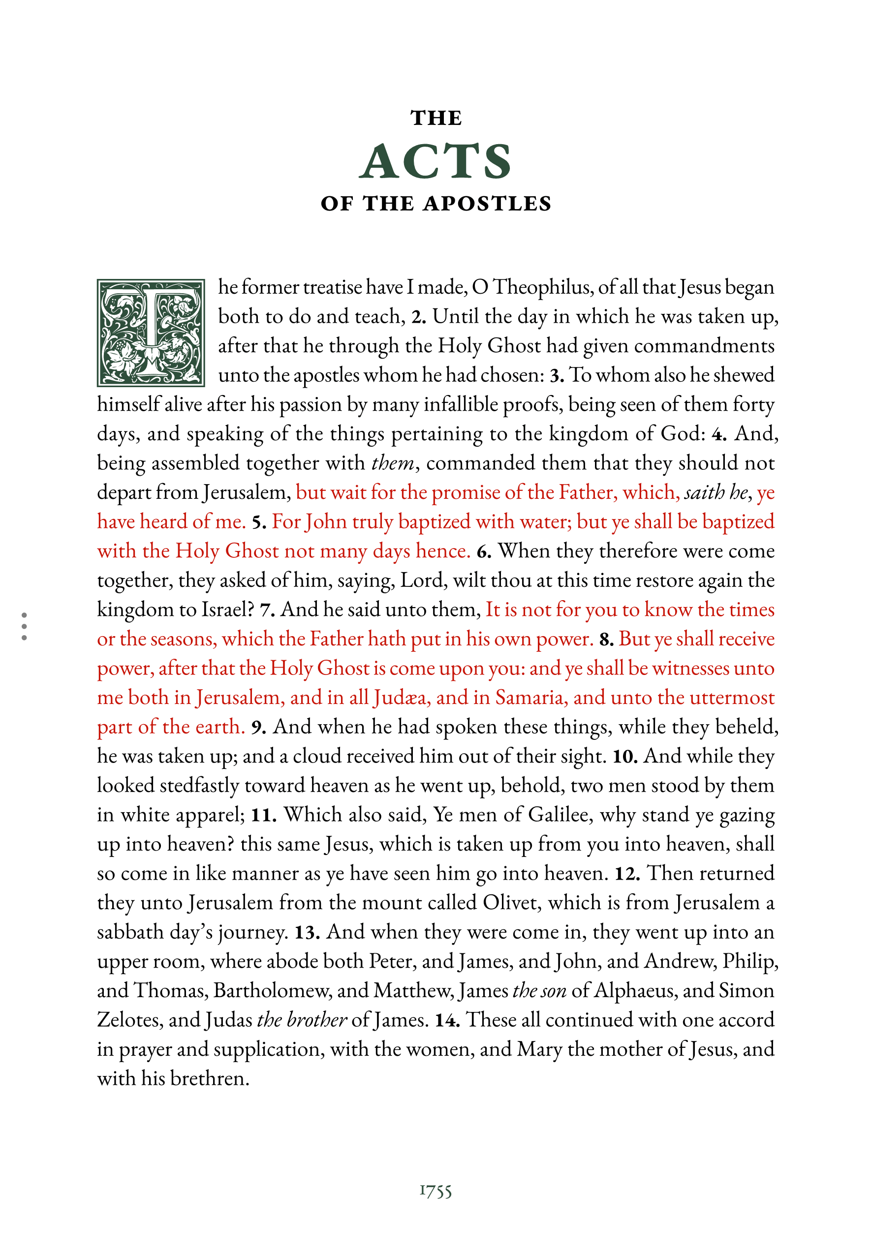
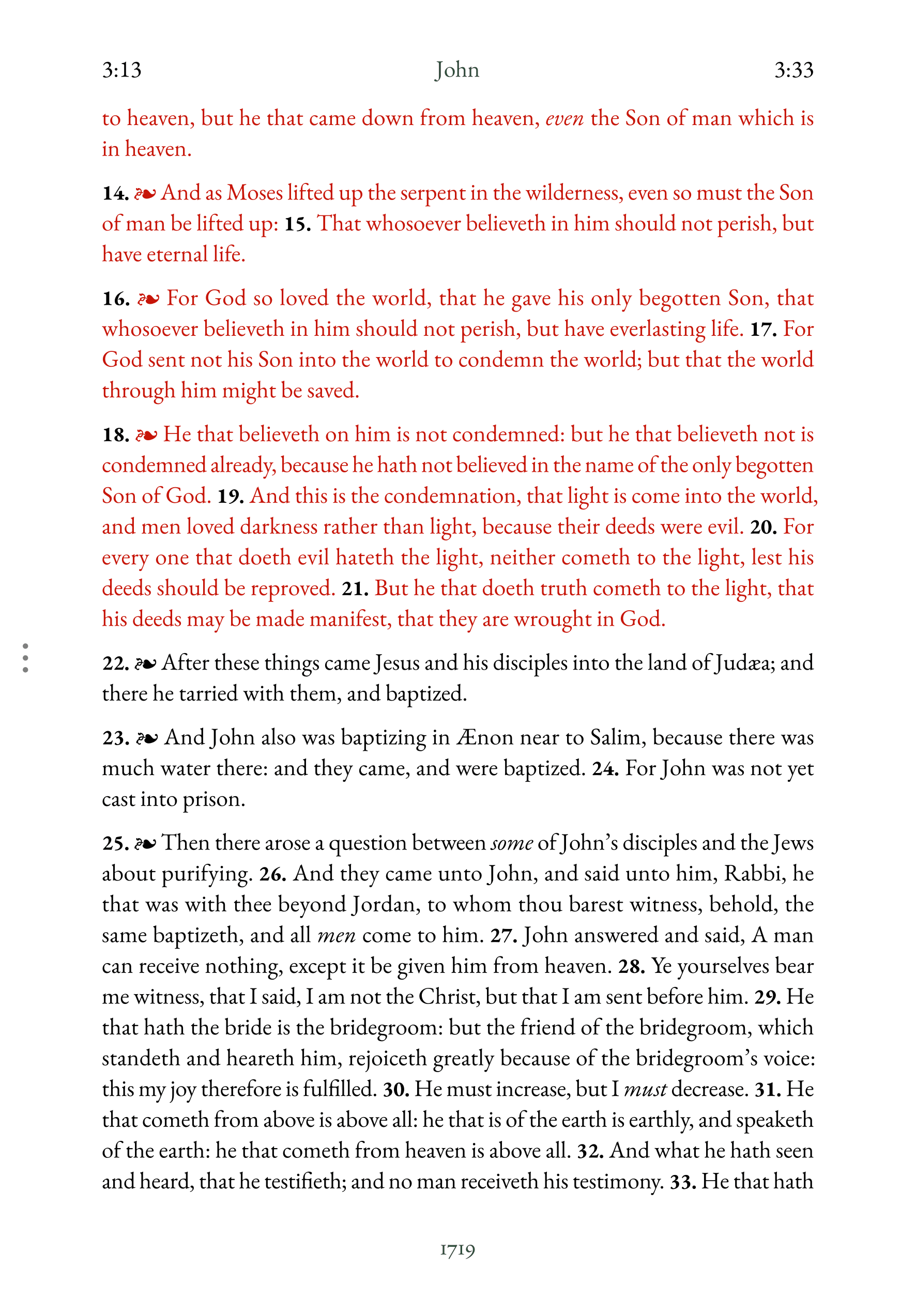
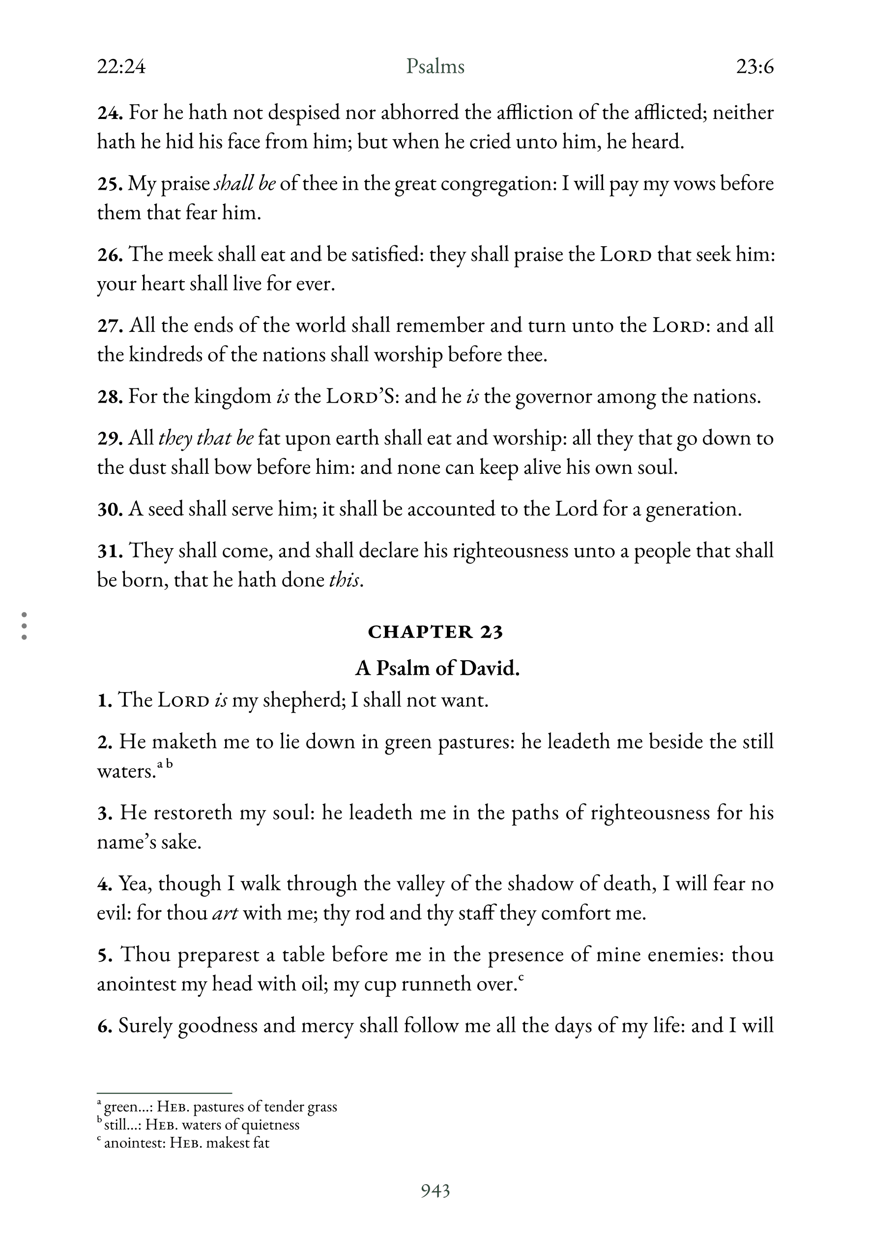
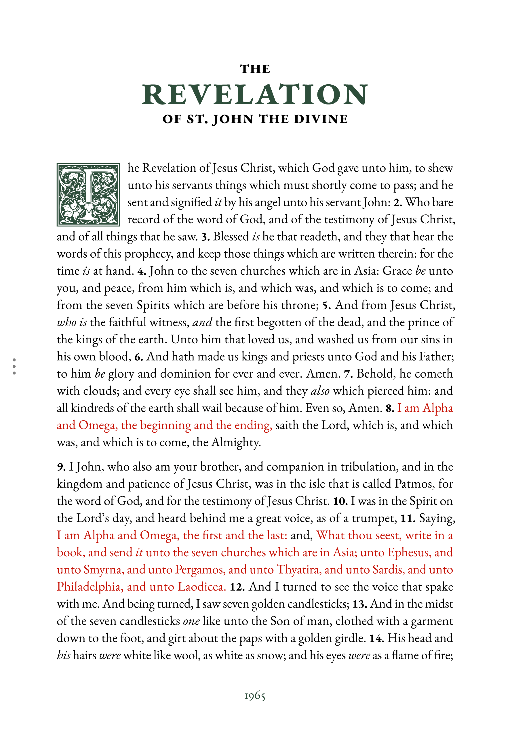
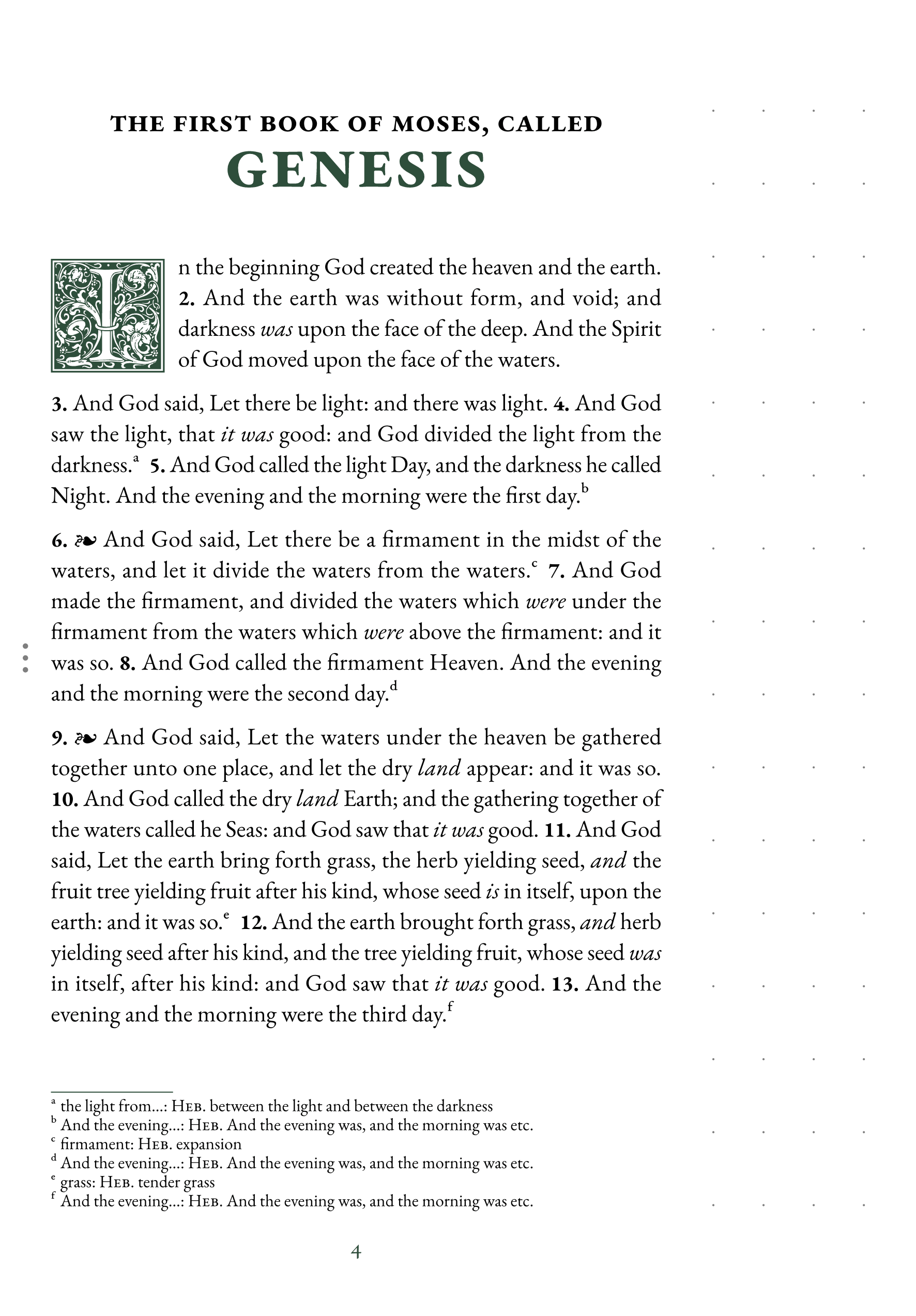
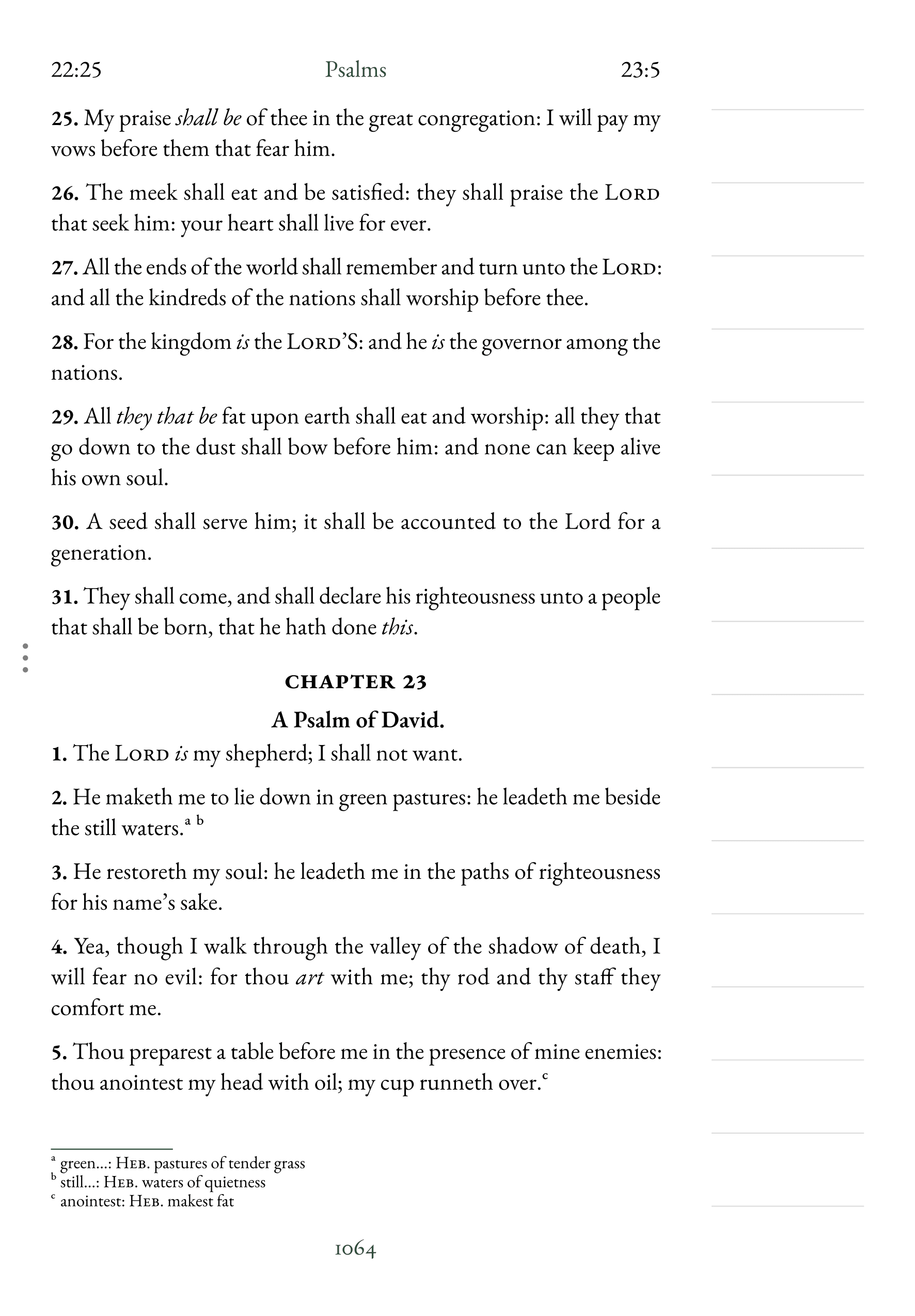
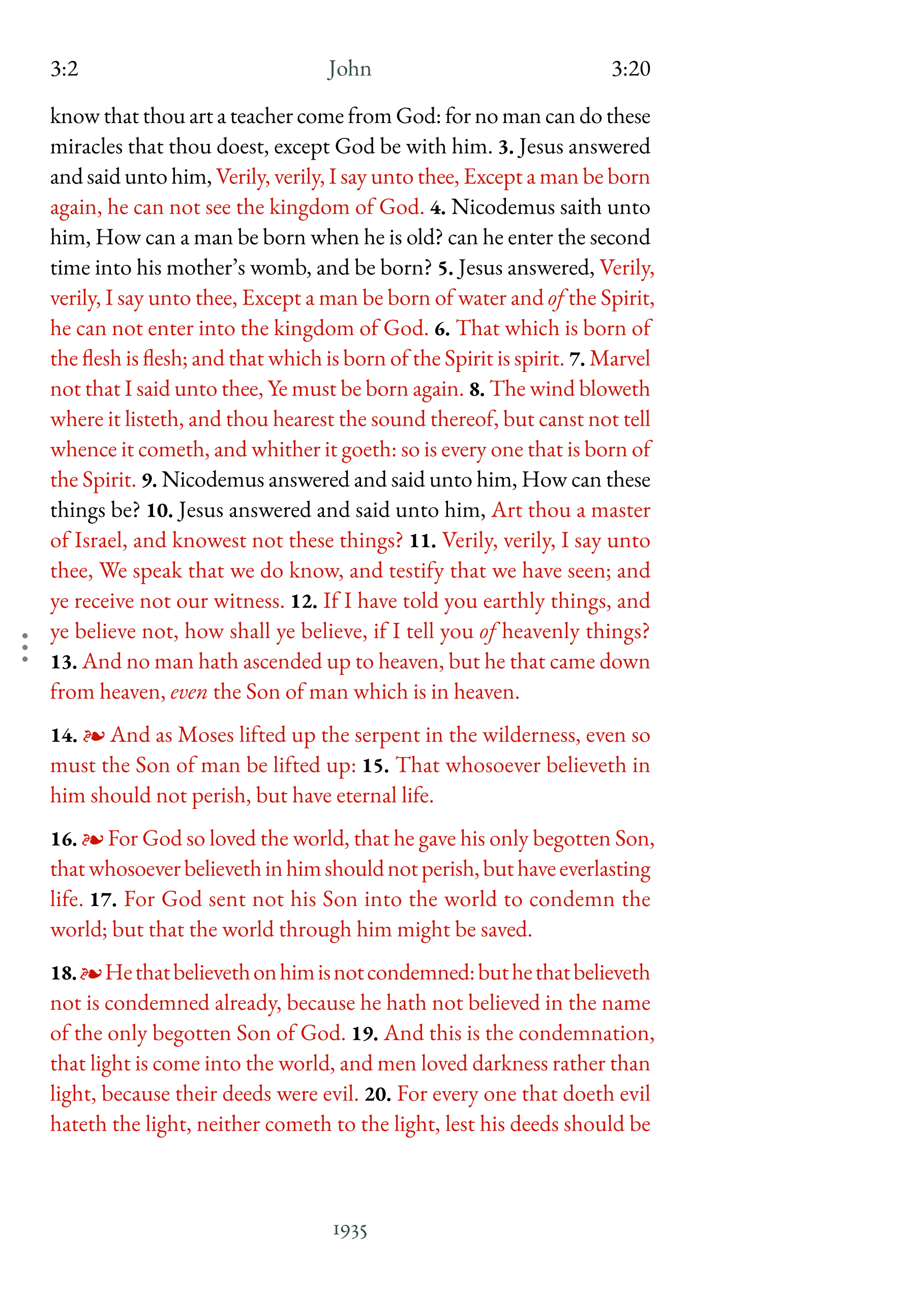
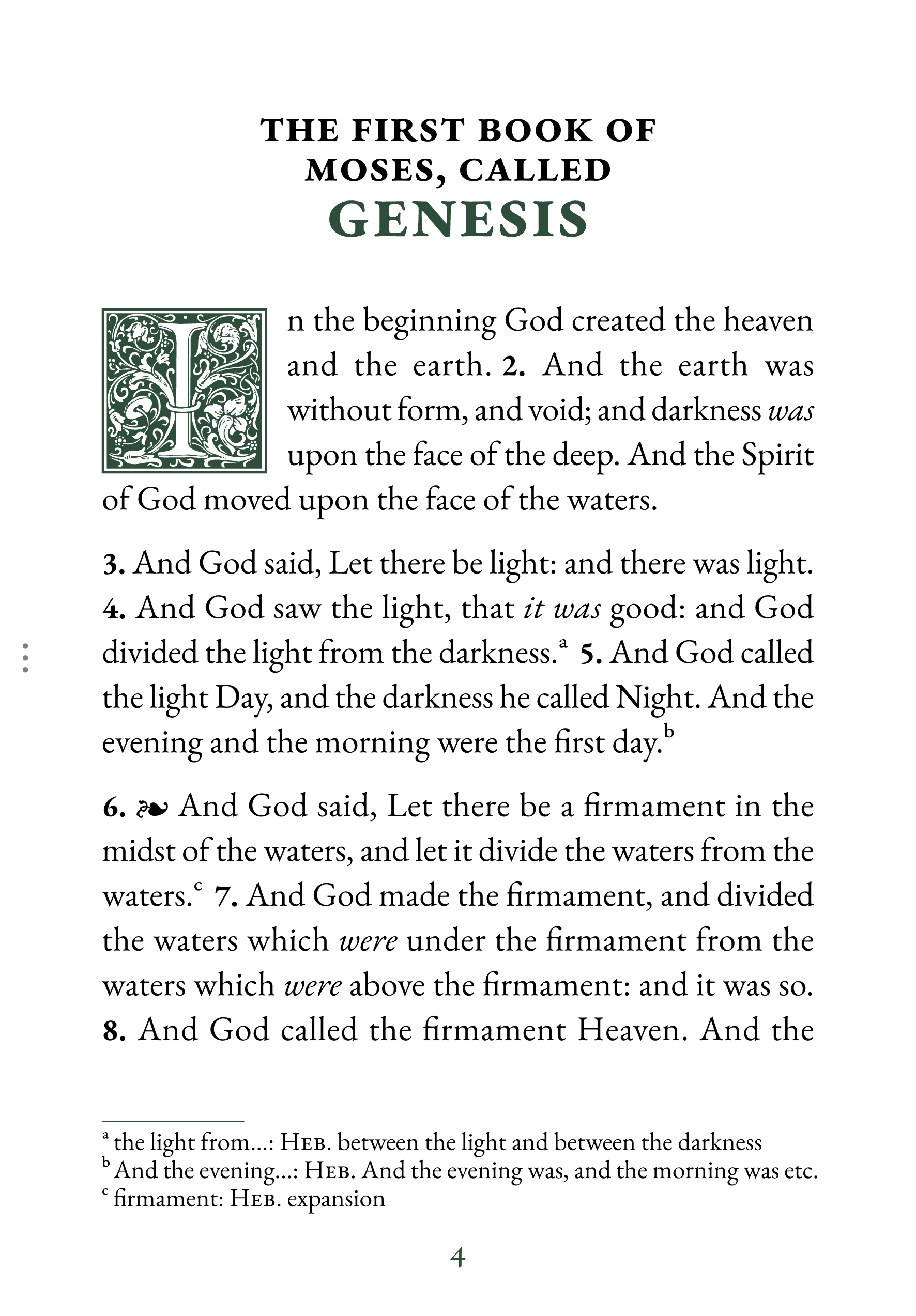
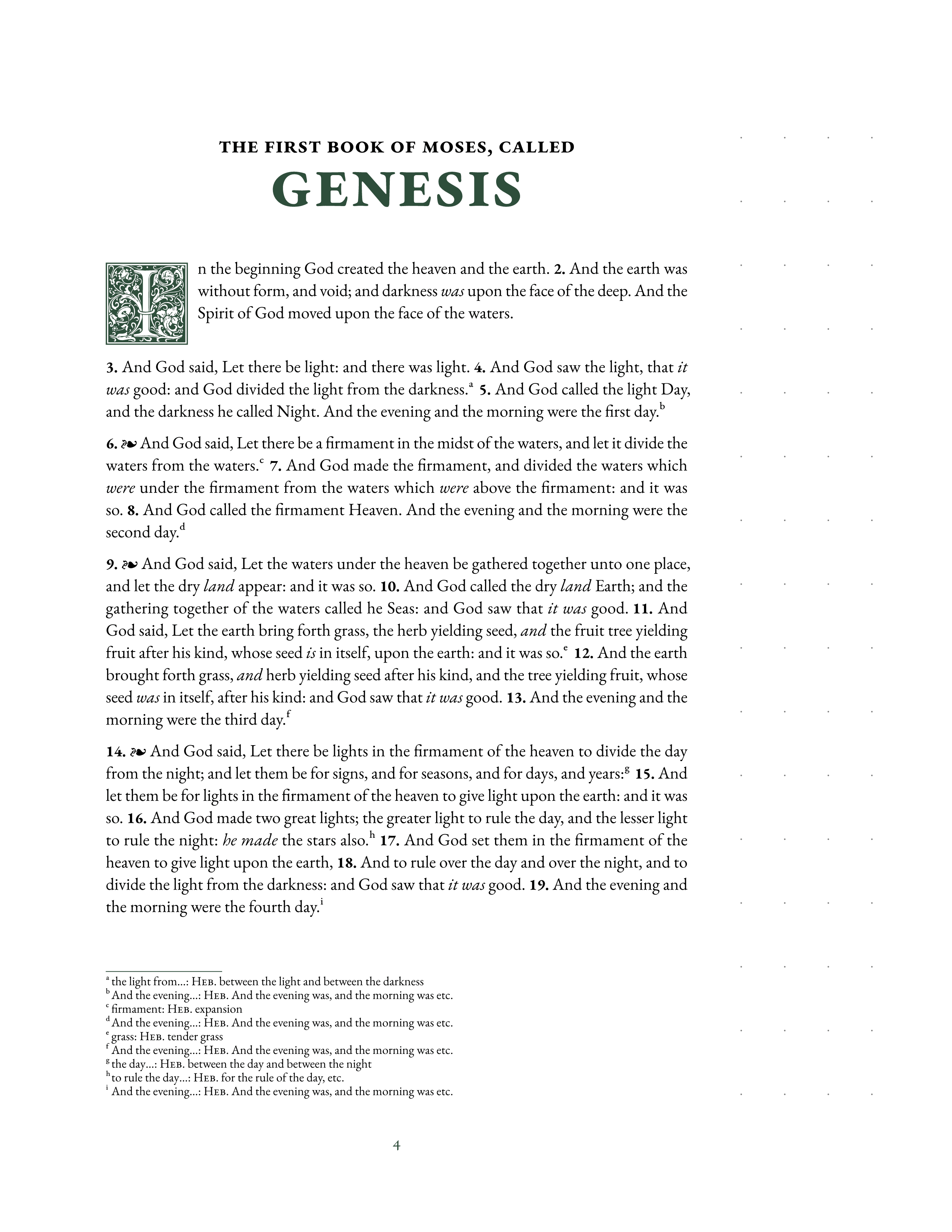
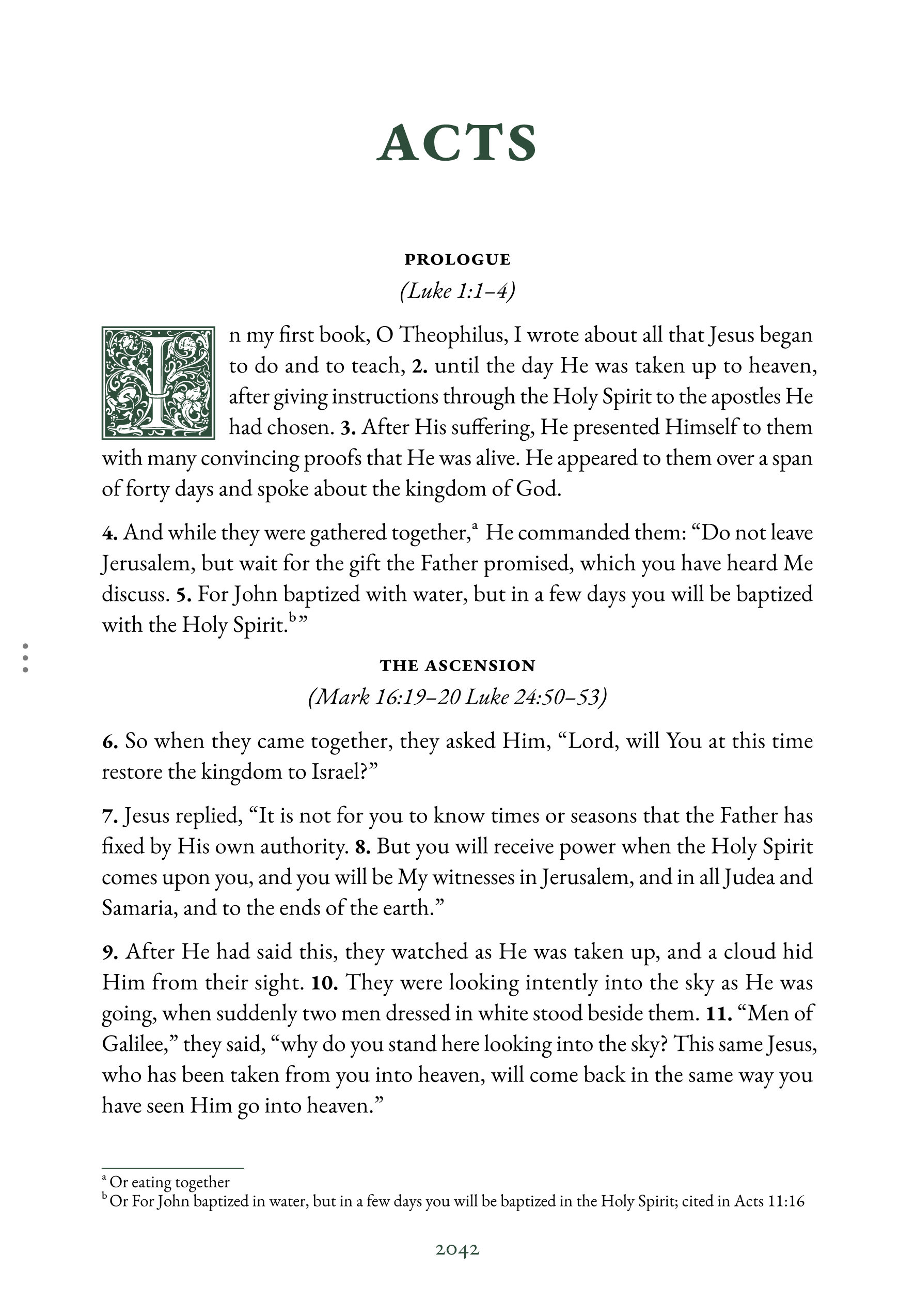
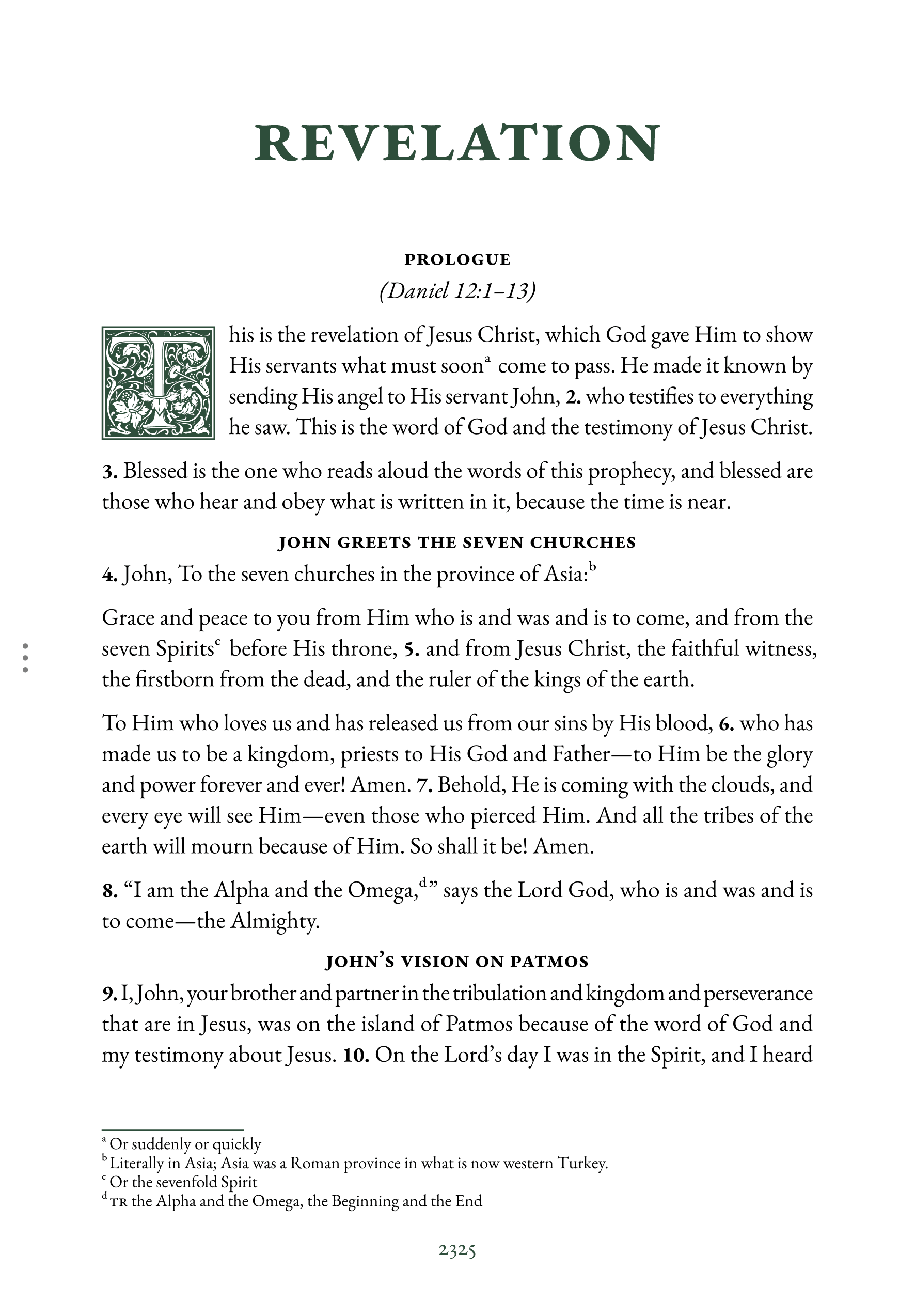
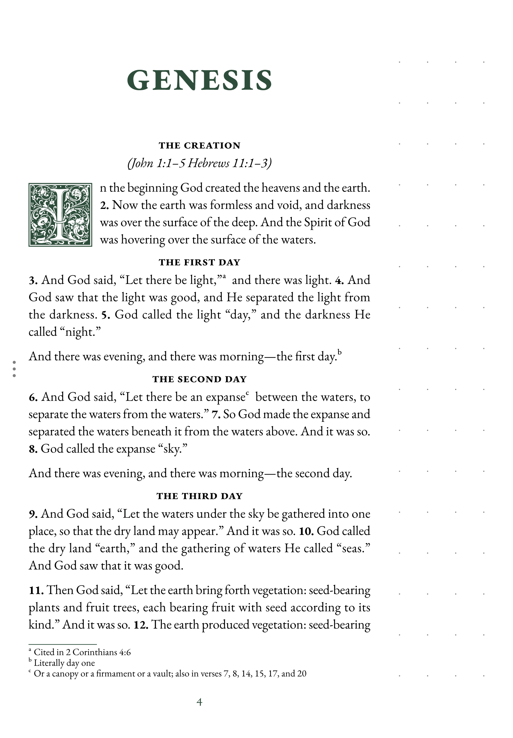

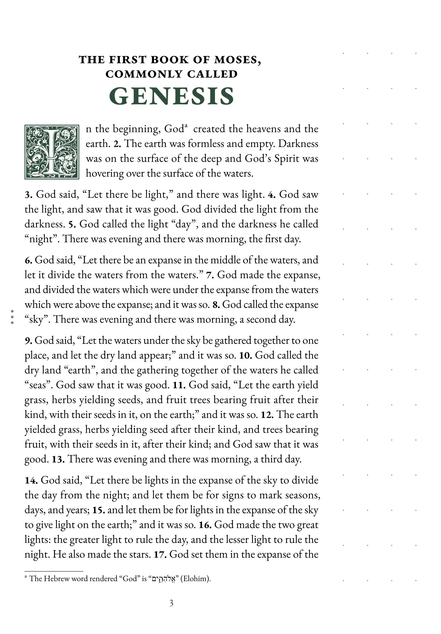
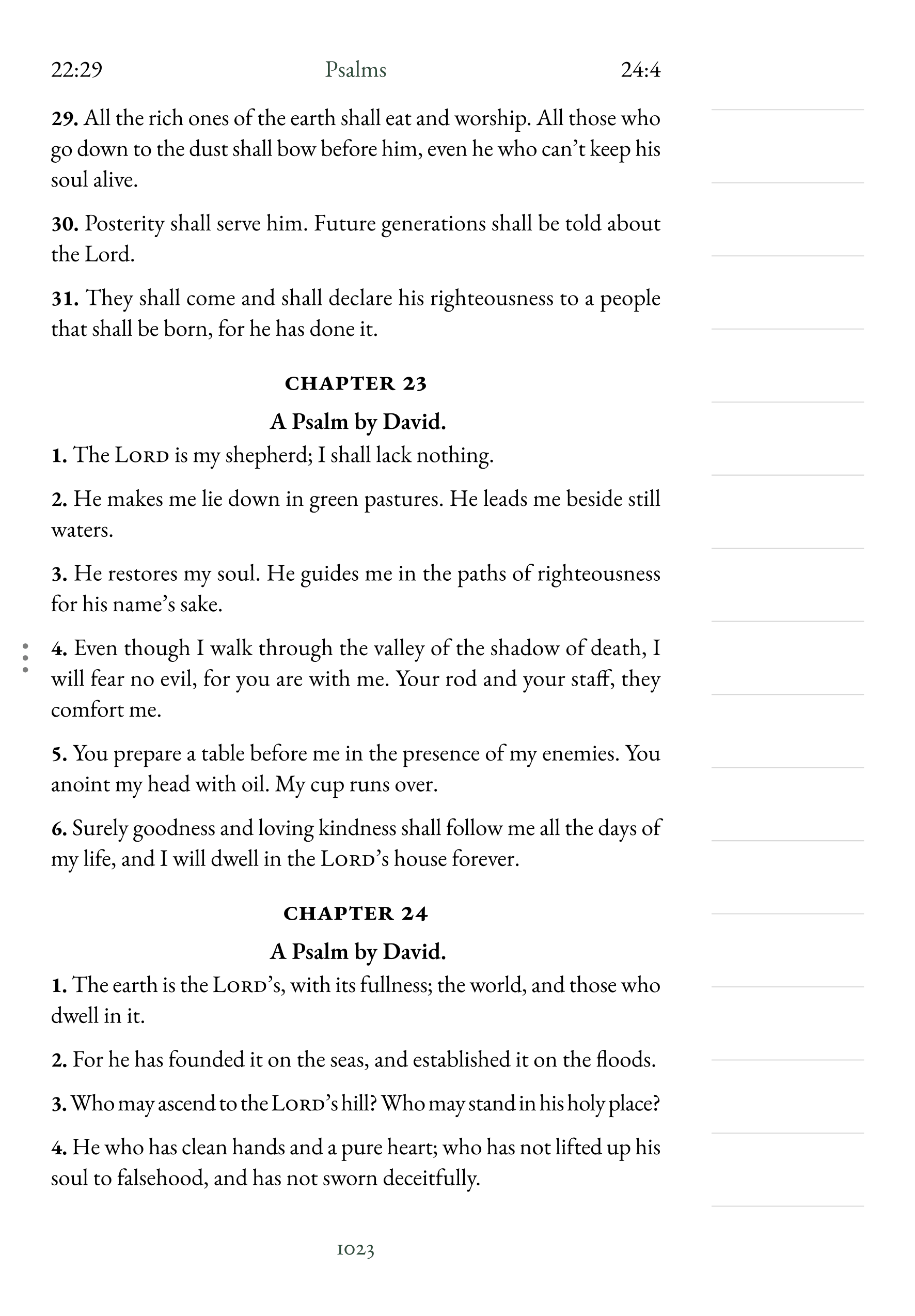
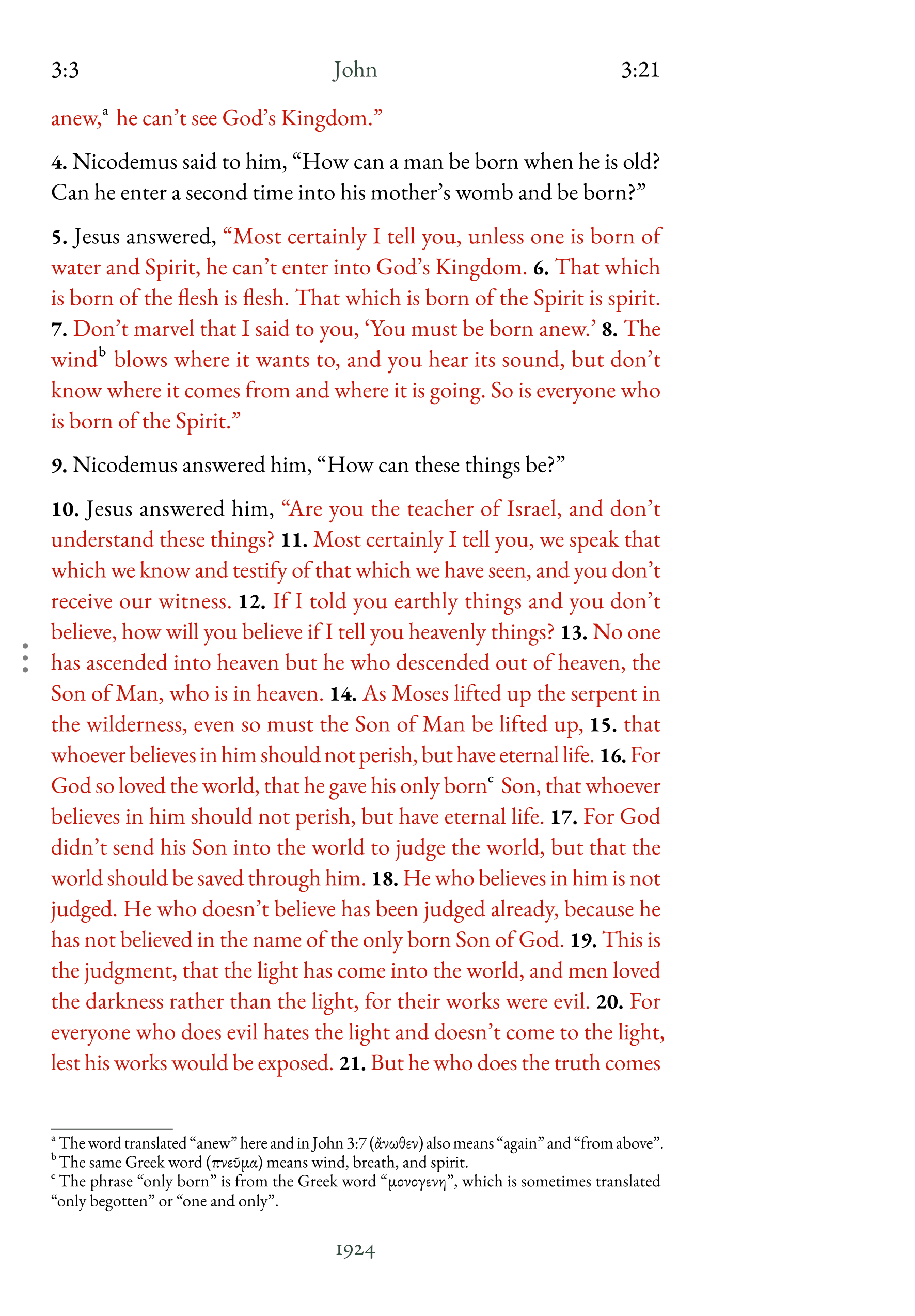
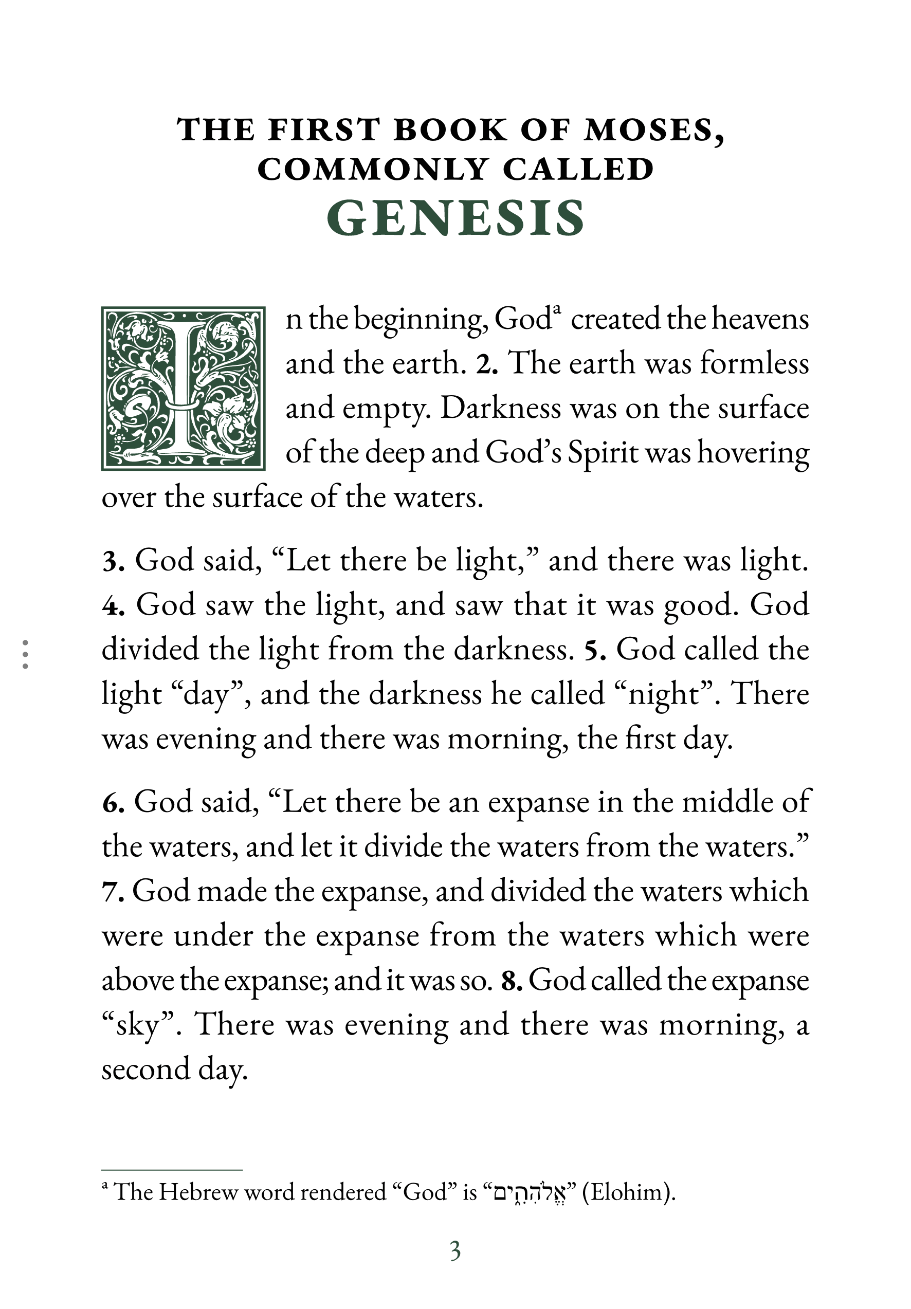
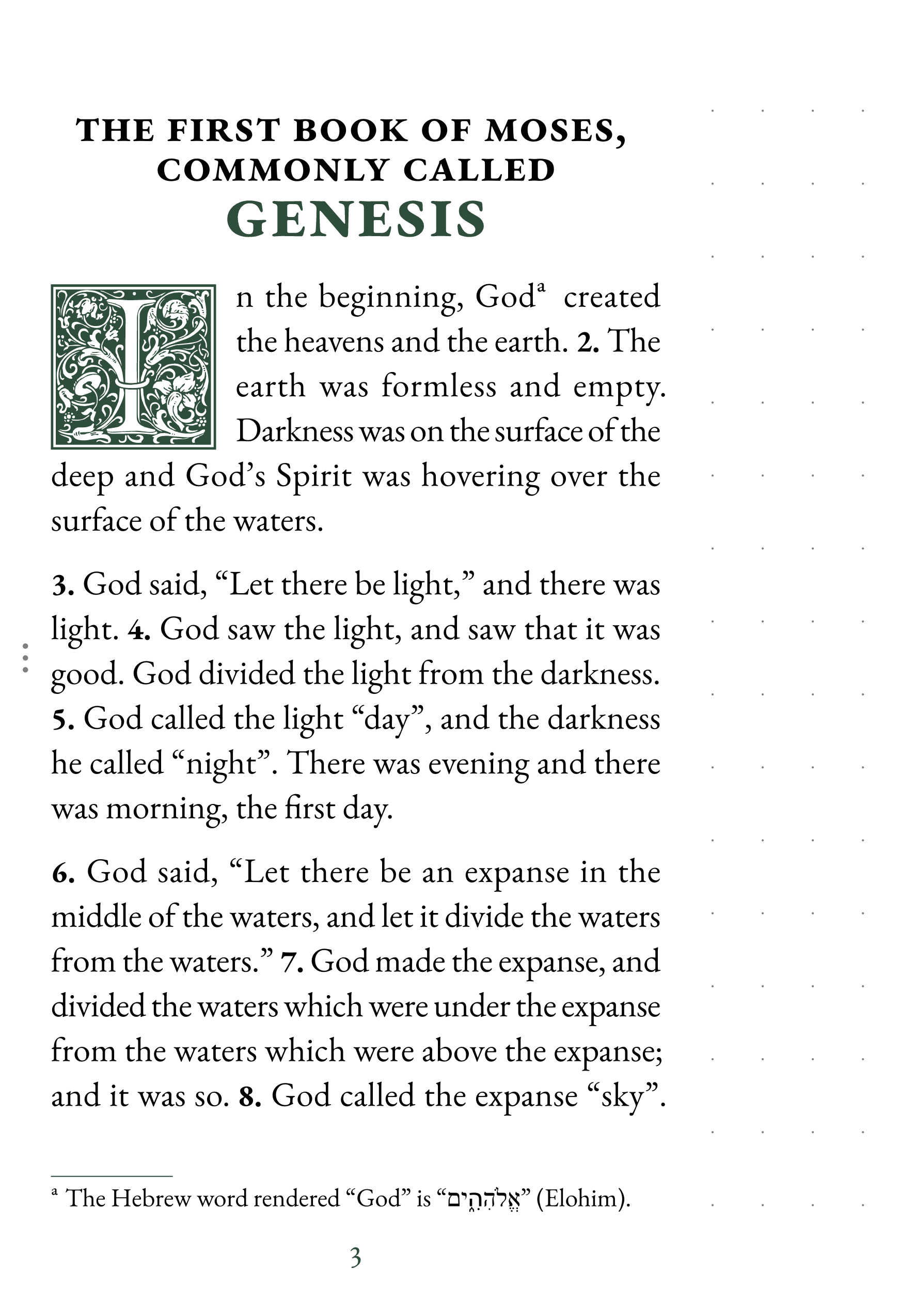
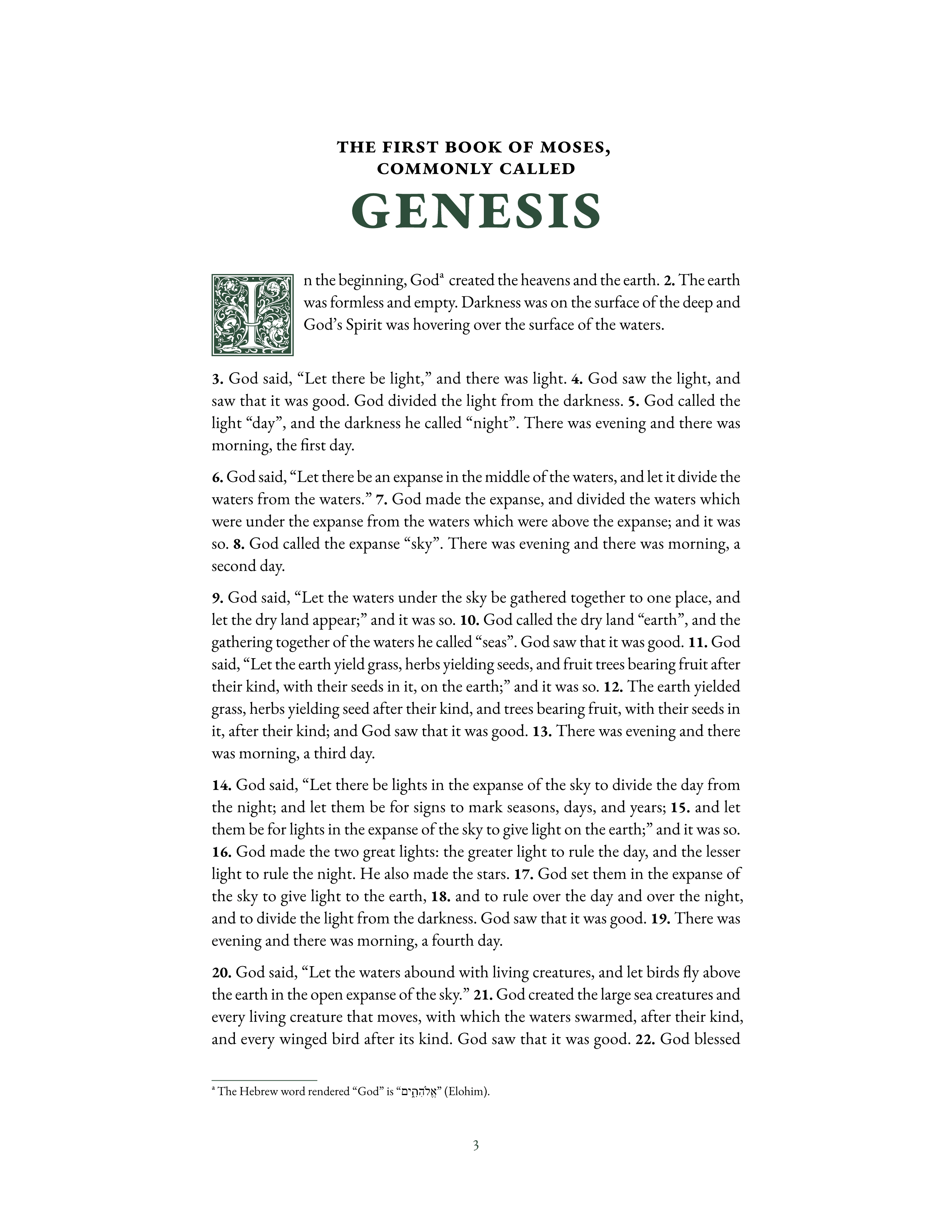
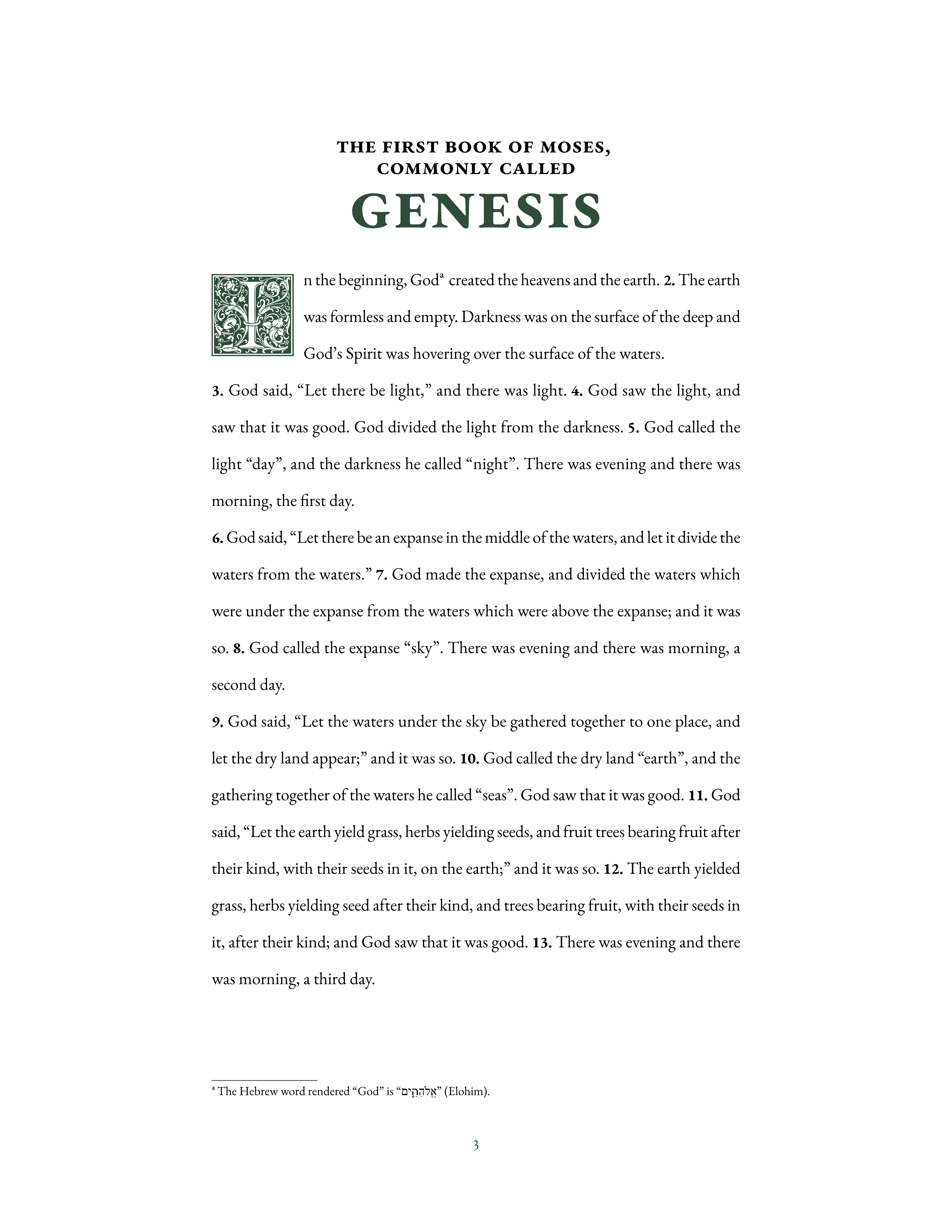
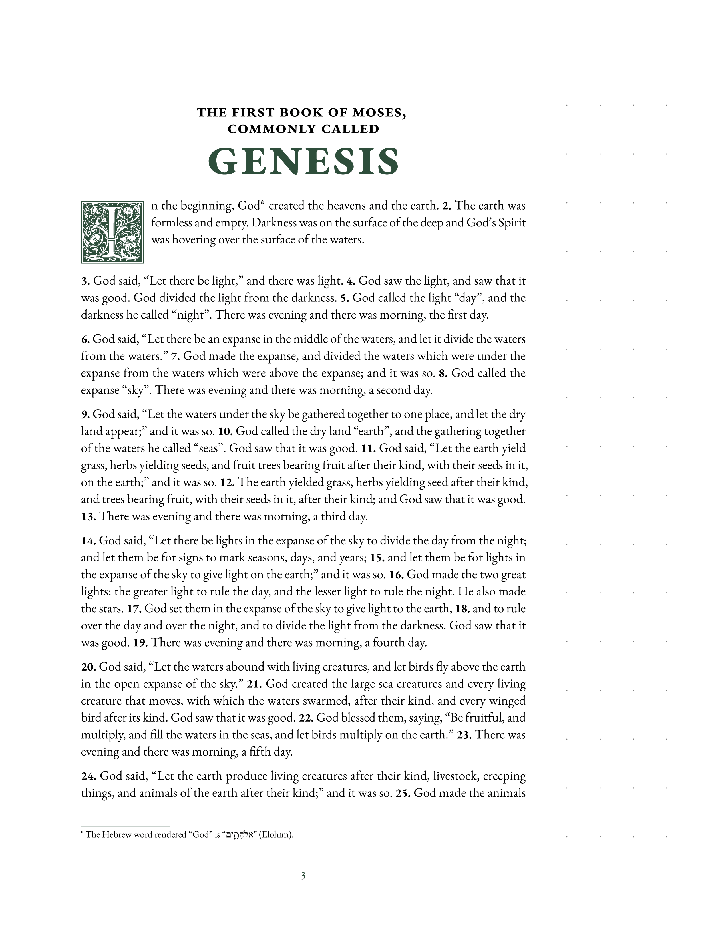
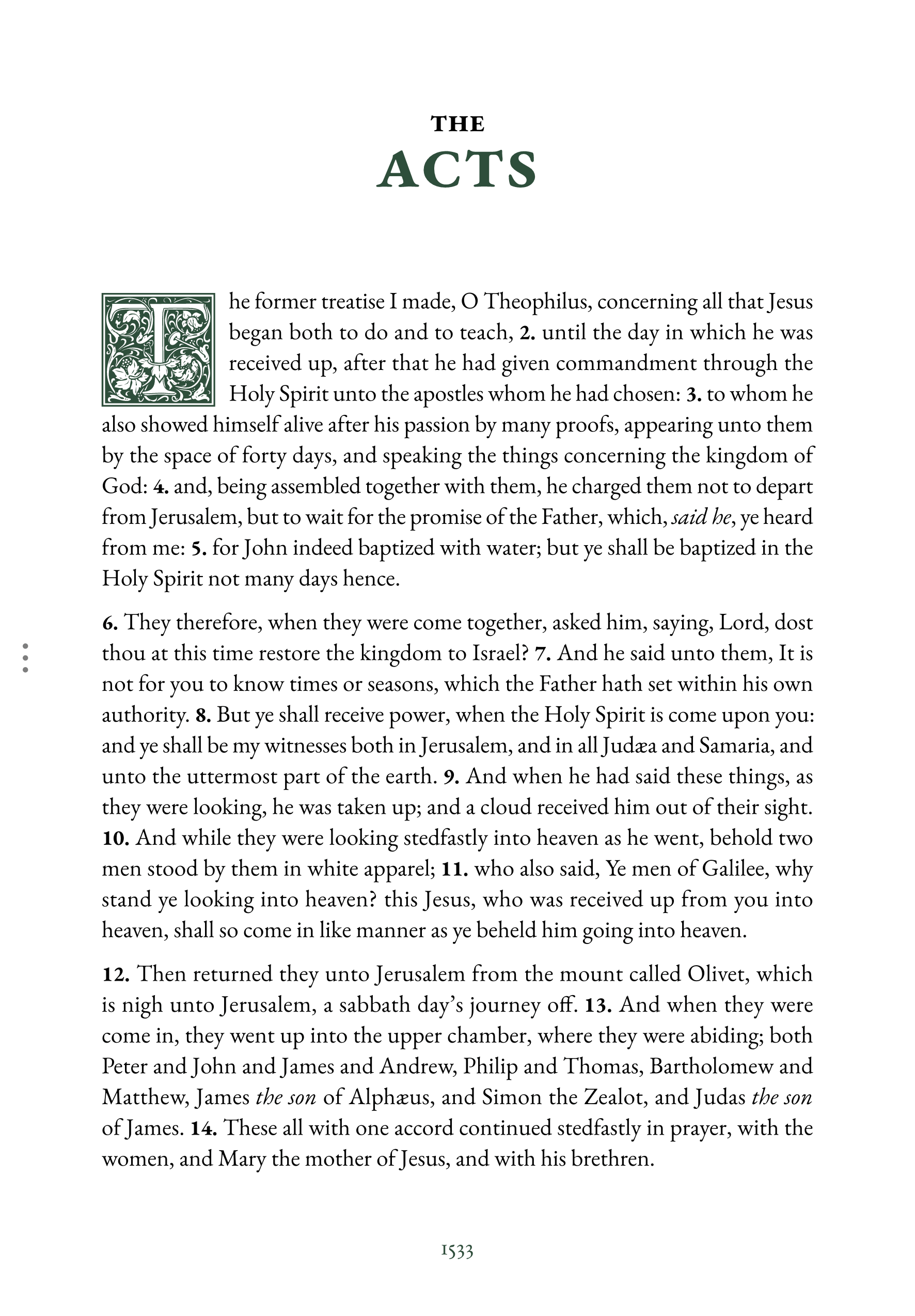
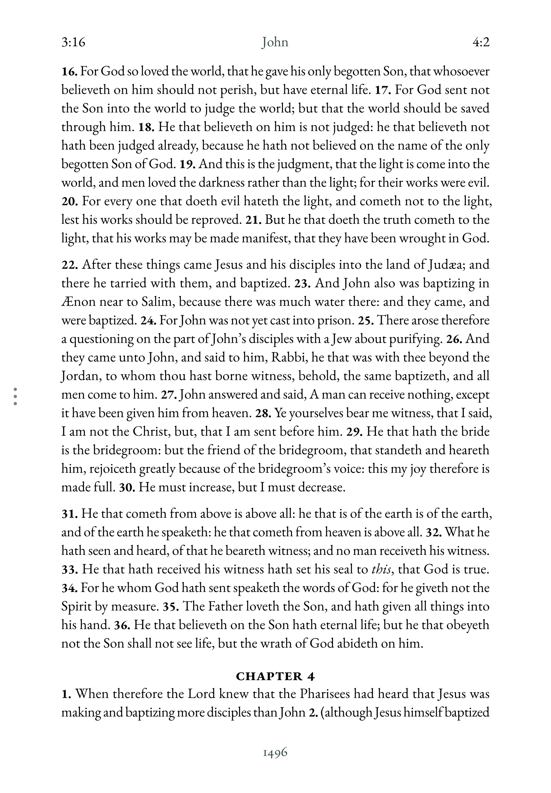
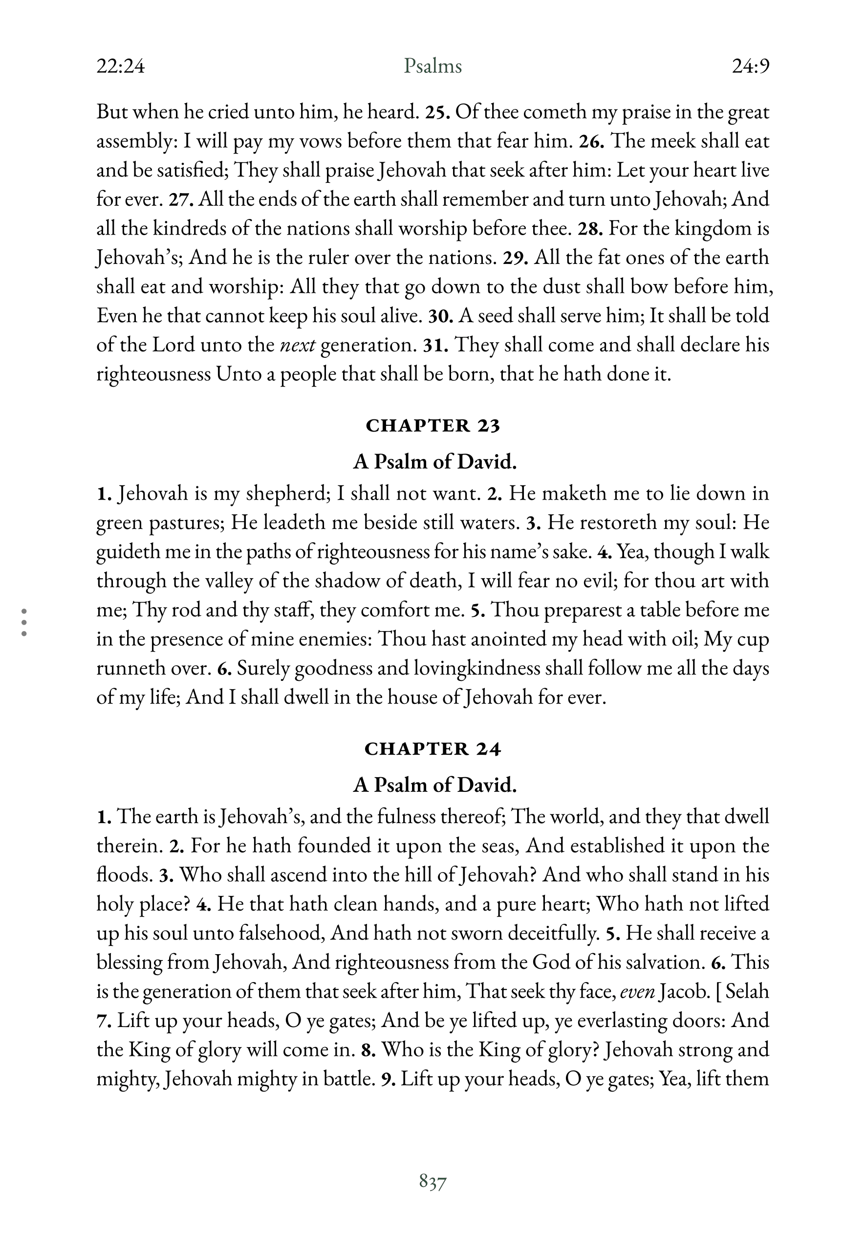
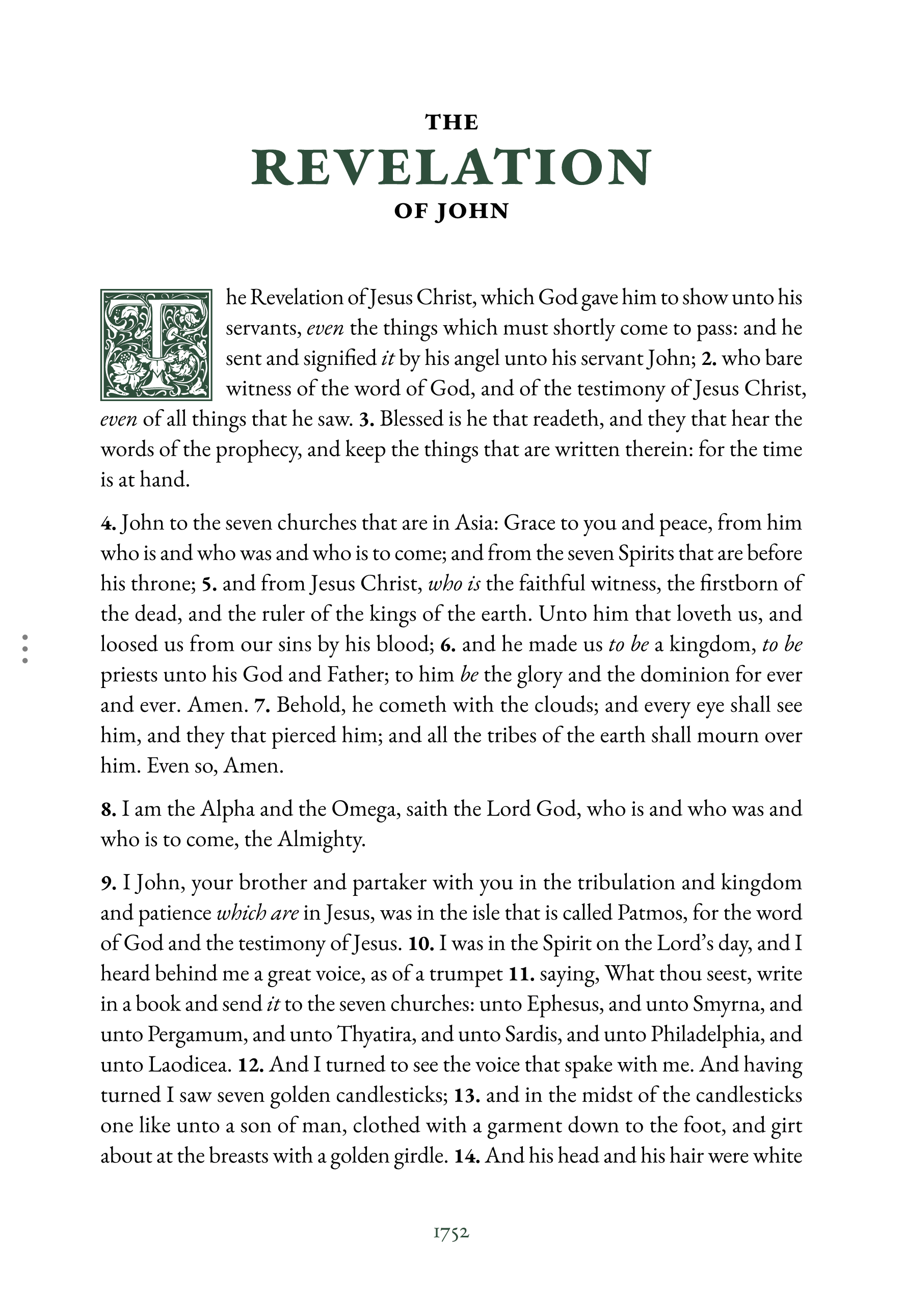
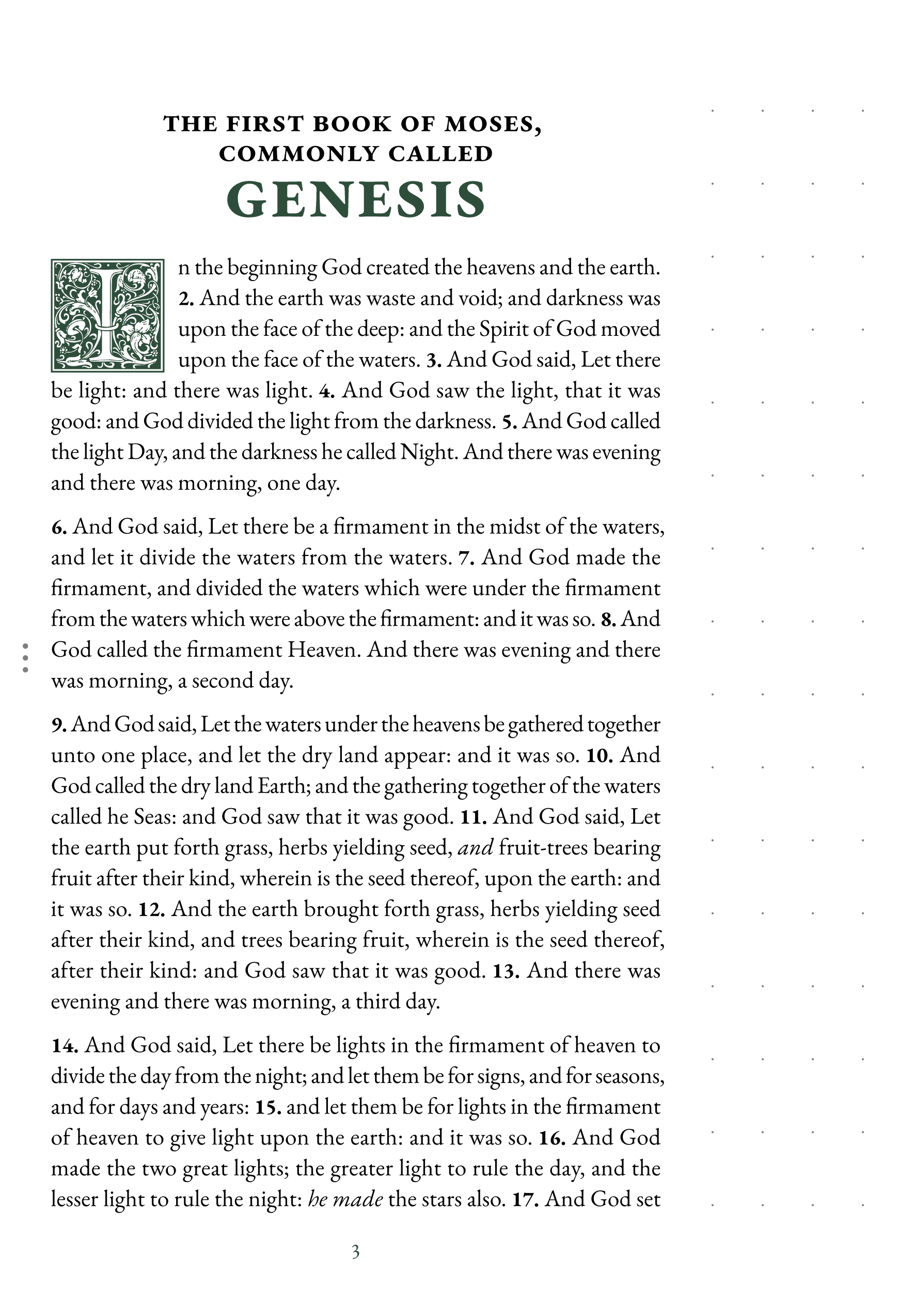
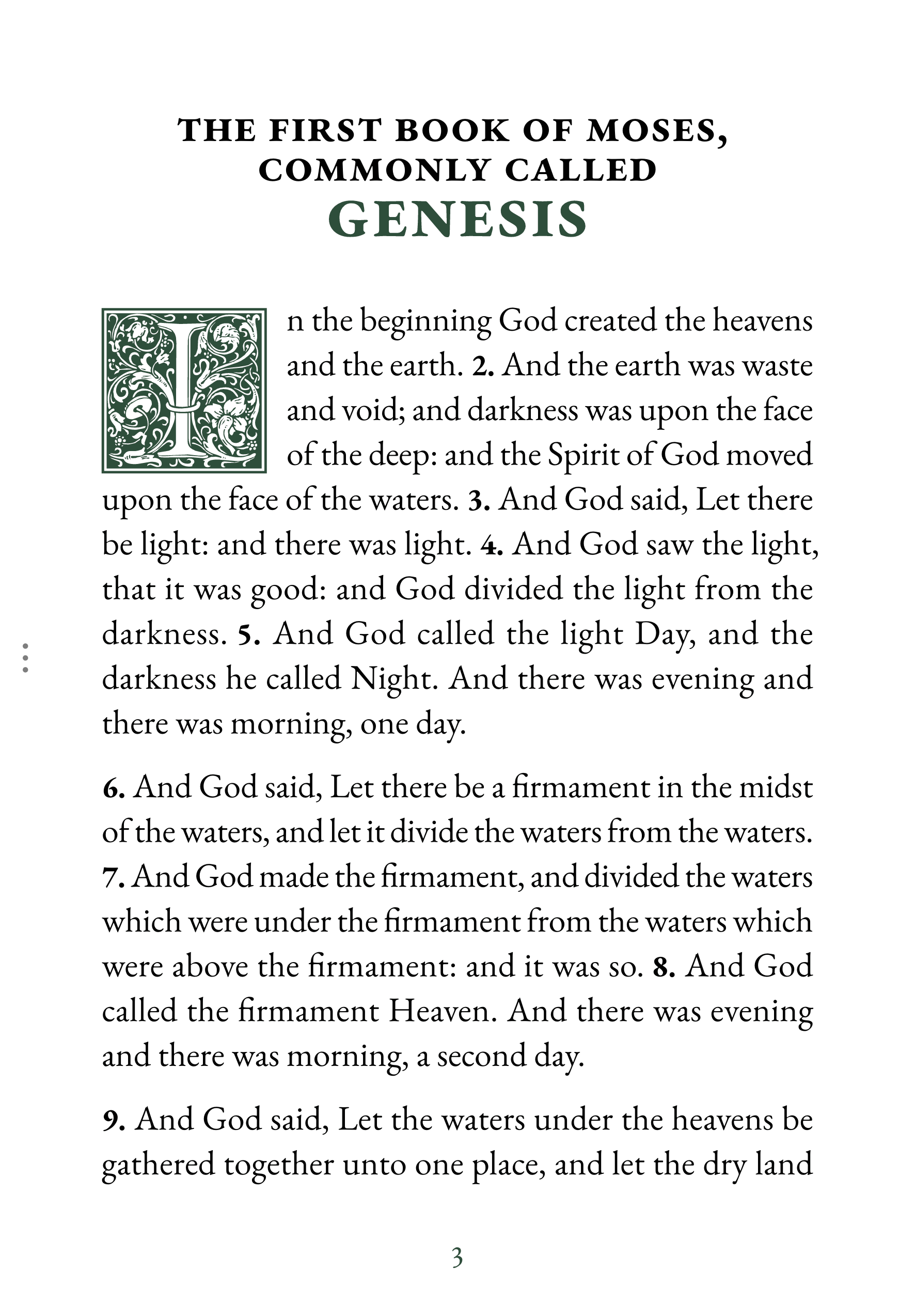
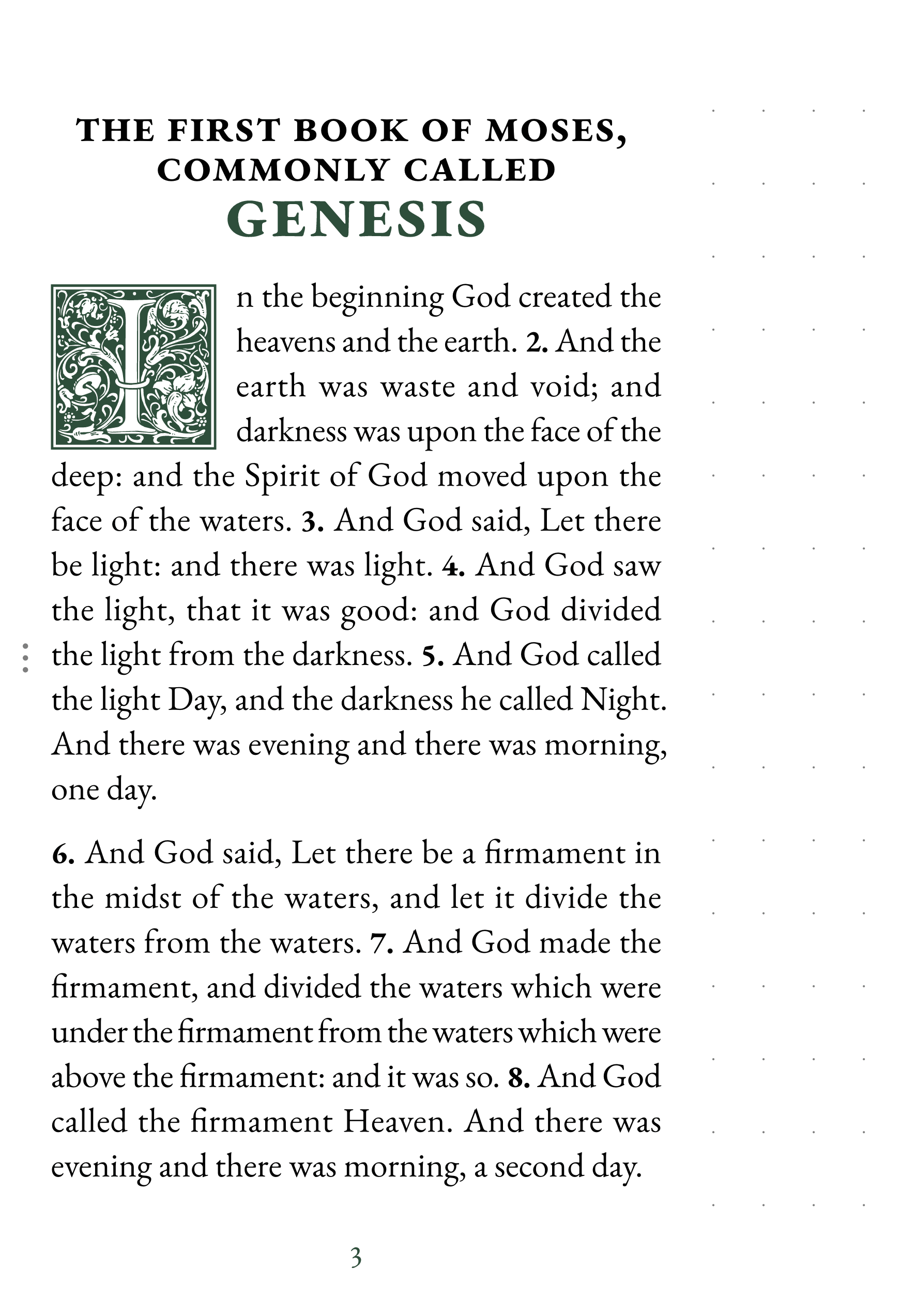
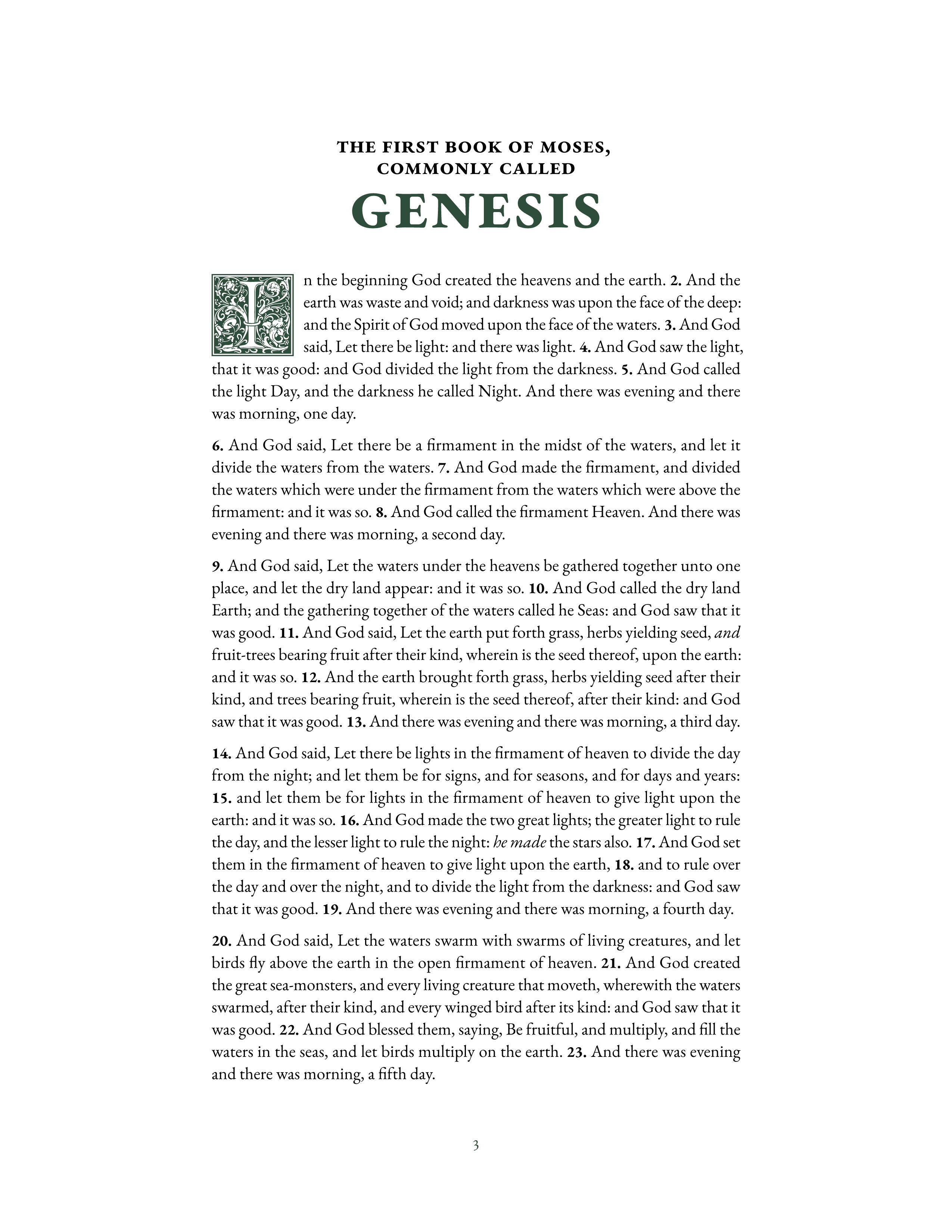
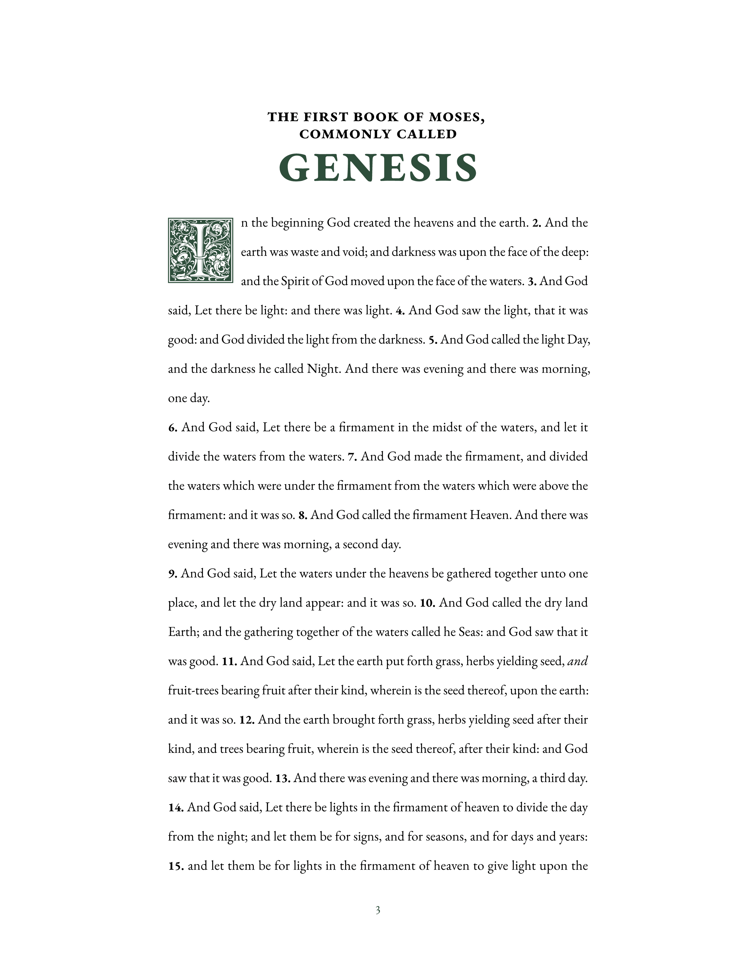
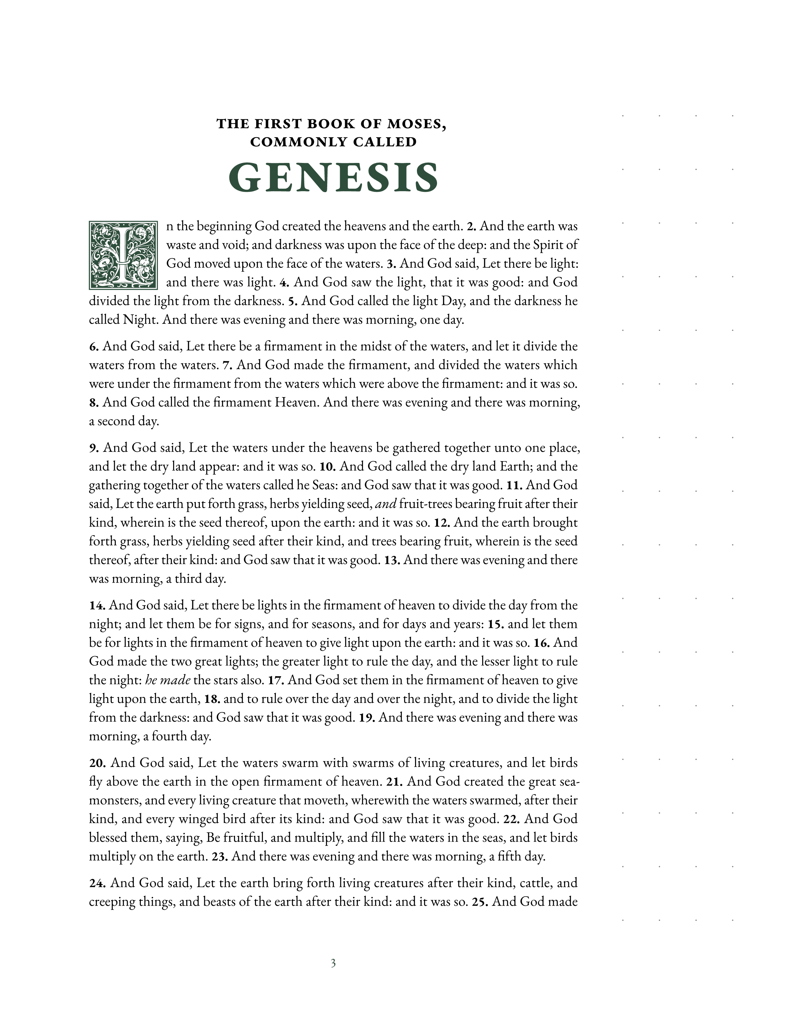
The Classic design draws on the heritage of printed Bibles. The serif typeface carries the proportions of hand-set text, and the layouts follow conventions that readers have trusted for generations. Every page feels deliberate and grounded.
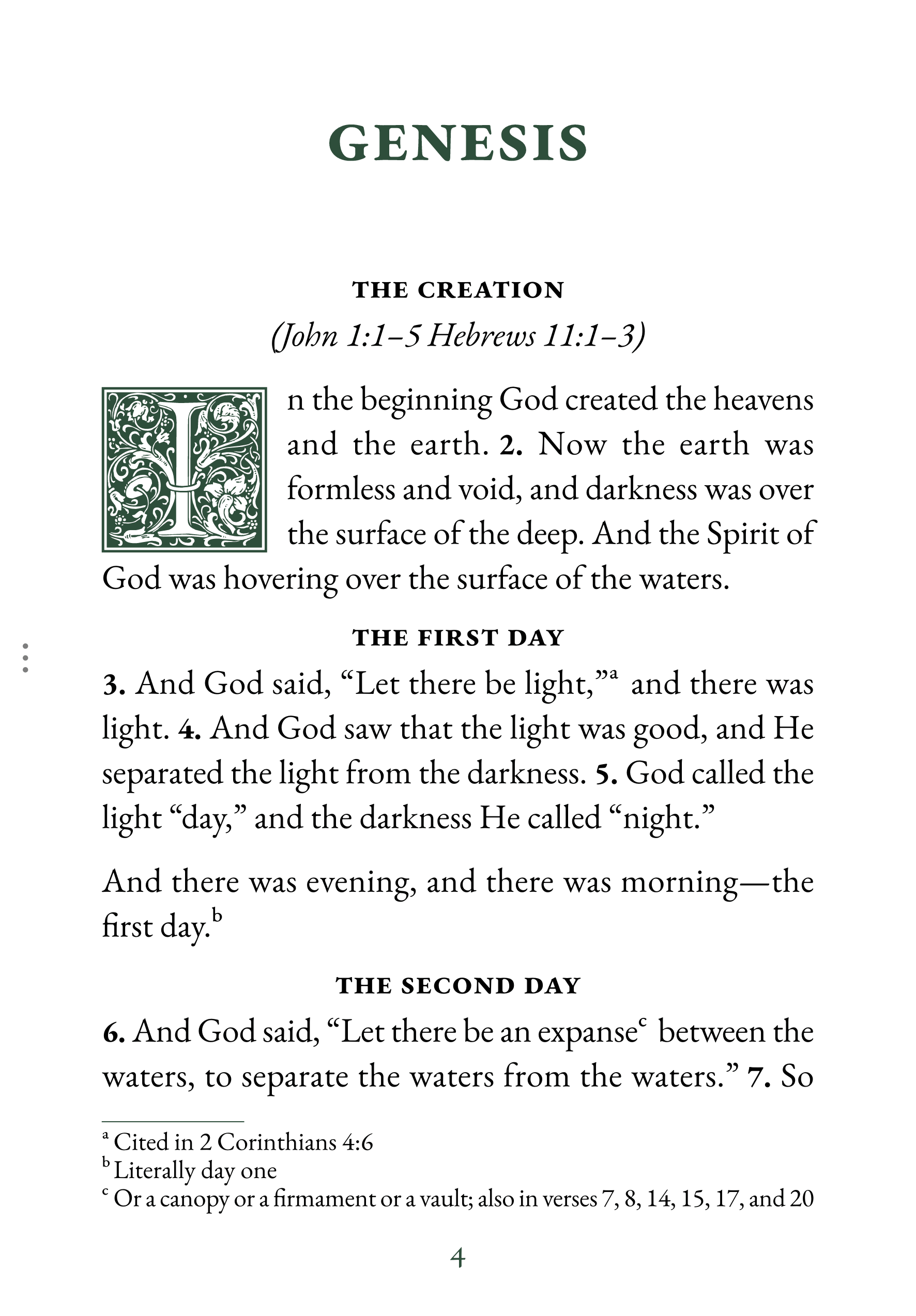
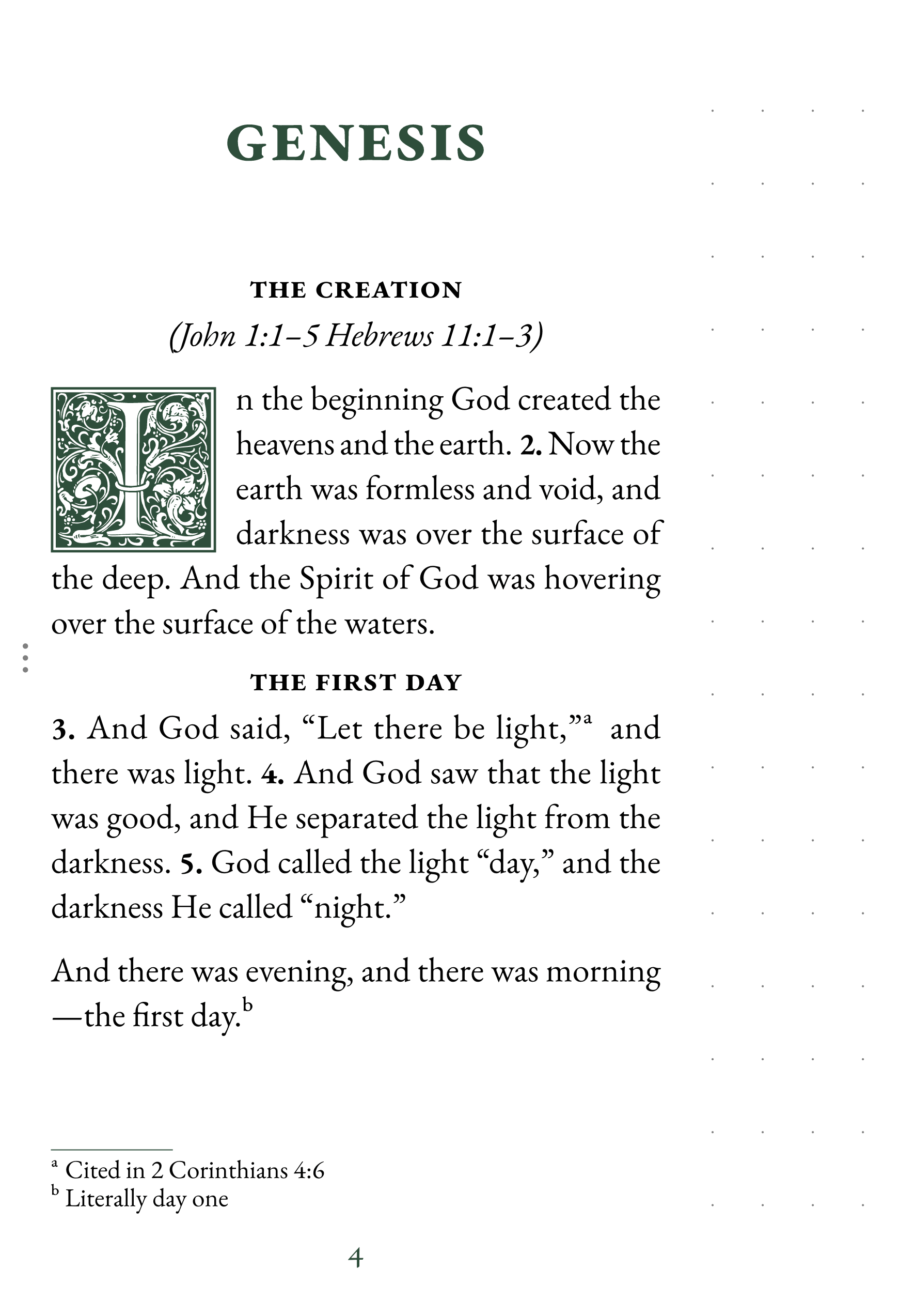
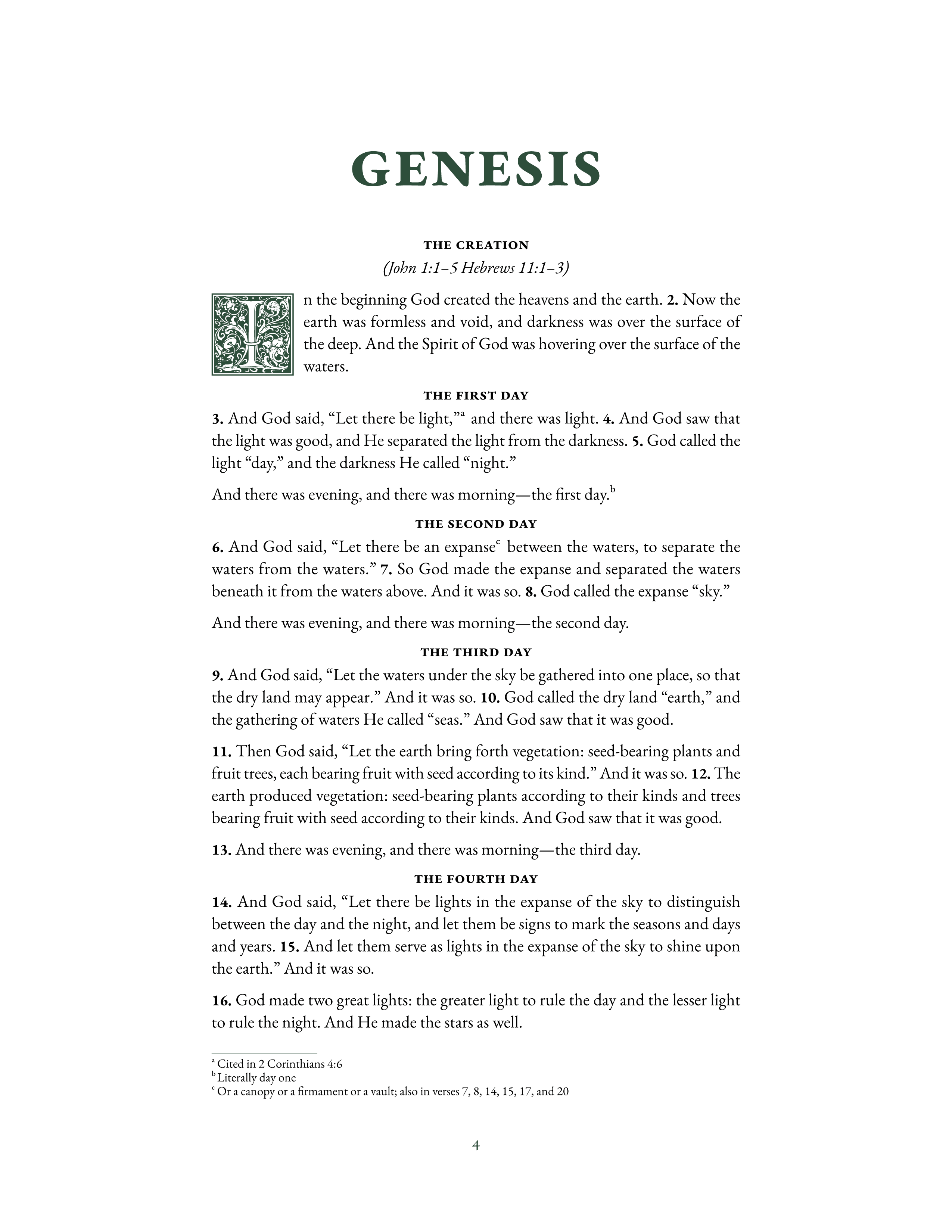
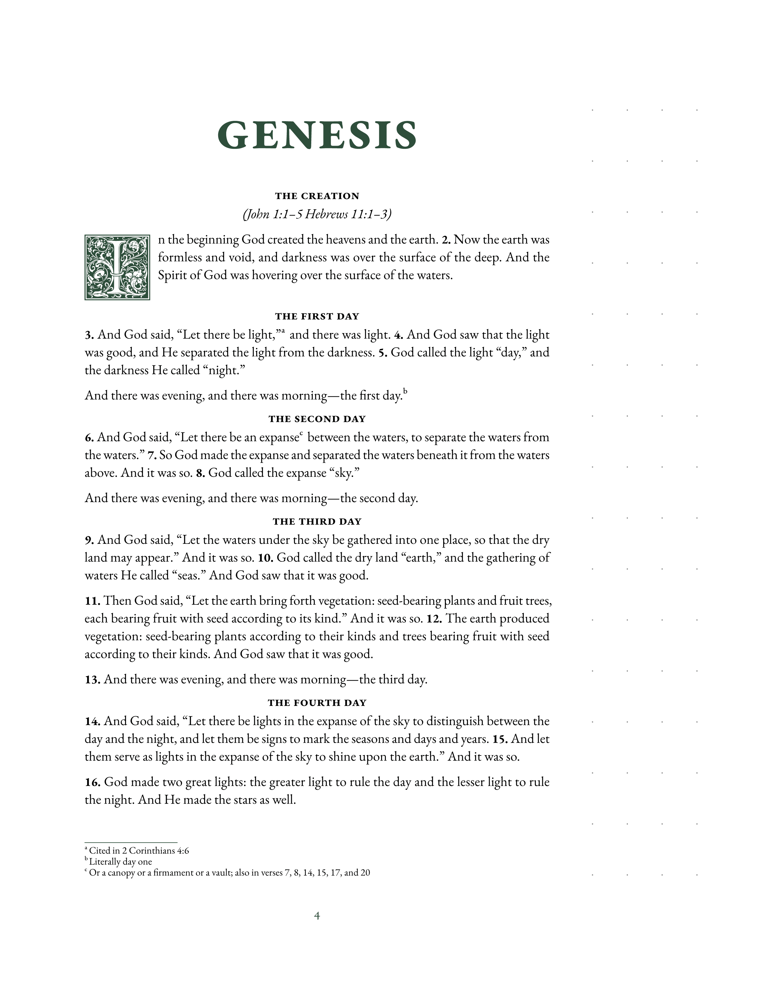
Ornamental drop caps open each chapter, styled after traditional printed editions. Margins and spacing feel familiar from the first page. Footnotes sit where you expect them, chapter headings hold their weight, and nothing on the page competes for your attention.
For readers who want their Bible to read like a book, not an app. The kind of pages you settle into.
Available in all editions and translations
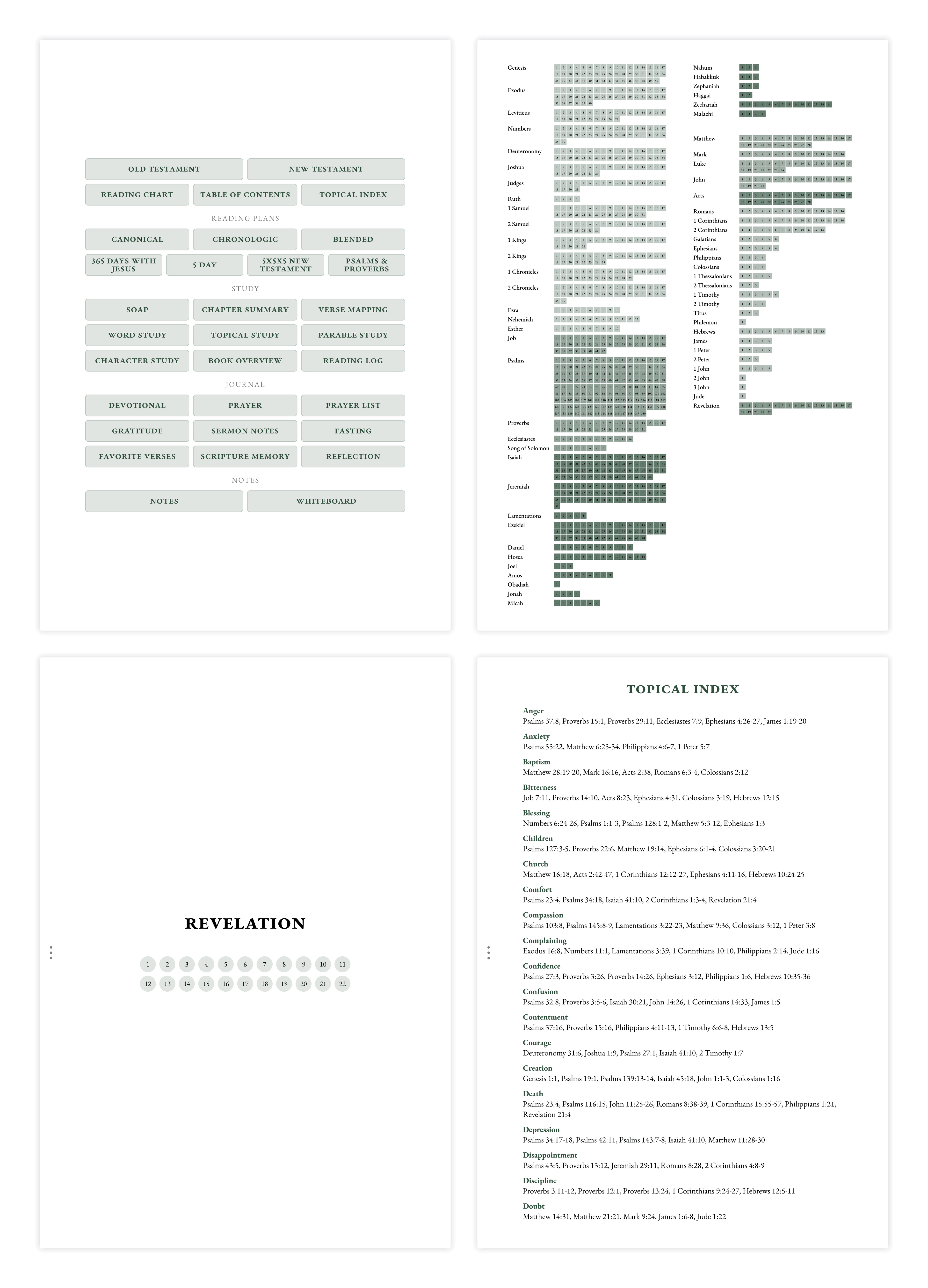
Journal Edition
Regular layout for focused reading. Journaling templates and reading plans in back. Phone and tablet.
- Formats: Phone and tablet
- Layouts: Portrait
- For: Reading and journaling
Notetaking Edition
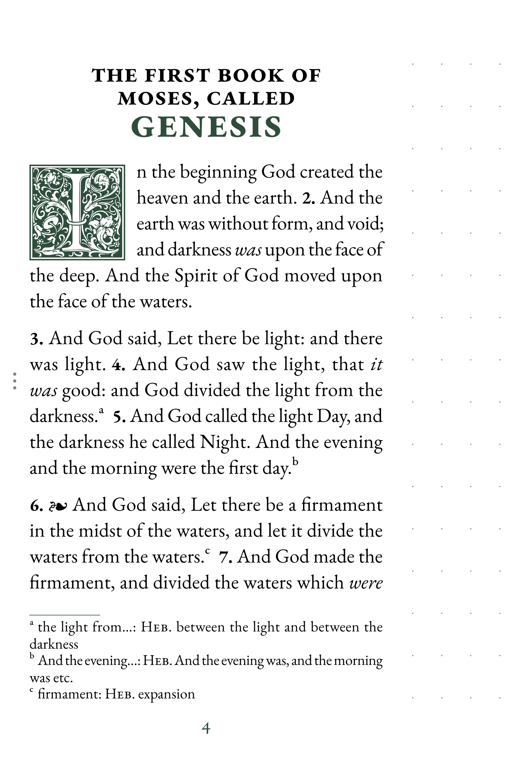
Wide margins on every page, sized for your stylus. Portrait and landscape layouts, for every tablet aspect.
- Formats: Tablet
- Layouts: Portrait and landscape
- For: Taking notes directly on the page
Large Print Bundle
16pt type with wide margins for notes. Includes the Journal Edition. Phone and tablet.
- Formats: Phone and tablet
- Layouts: Portrait
- For: Comfortable reading and notetaking
Print-at-Home Edition
Binder-ready Bible PDFs in A4 and US Letter. Four layouts in one bundle.
- For: Binder and loose-leaf study
- Formats: A4 and US Letter
- Layouts: Reading, double-spaced, notetaking, large-print
Looking for a different feel?
See all designs